Thursday, November 27, 2008

First reasonable screenprint

It's taken a few months but I've finally got a reasonable silkscreen print, in fact four of them. I made the stencil with drawing fluid and screen filler and printed the image onto Grumbacher pastel paper which took the acrylic ink very well.


Each of the sheets of paper measures 18 x 12" and is a different colour. I hand-coloured one with metallic inks (below).

Sunday, November 23, 2008

Beginnings 1.3


Stage 3

Here's the next stage of this painting. Not an awful lot has been done, except I've repainted the sky again and put in the house. I'm working on the tree separately but am having misgivings about not only this painting but the whole series. Nothing like showing something in public to bring the issues into focus. If the photo seems a bit weird it's because I don't have a regular camera at the moment and took this rather awkwardly with a webcam. 

Earlier stages:

Monday, November 17, 2008

Twisted tube

I'll have no camera for a week or ten days and will be unable to post updates to the series until the new one arrives. Meanwhile, this picture shows how not to design a paint tube/cap.  The tube is more than half-full but when trying to get the cap off, the tube twists in the opposite direction and eventually springs a leak. (I've only had it happen with this brand. Other similar-looking paints open normally).


Thursday, November 13, 2008

Beginnings series, No 1 stage 2

Stage 2


The whole land area was too small, compressed into the lower third of the canvas. I didn't want the top of the land at the half-way mark either, so it's now at the Golden Section which is much better. I've repainted the sky, not sure I like it.


Stage 2

Earlier stages:
Stage 1

Monday, November 10, 2008

Beginnings series, No. 1 stage 1

The revised series for my major project is provisionally titled "Beginnings". In addition to the other things, I thought about the size, the surface and the medium. The maximum size is limited by the cost of sending the work to England eventually, but for this project I wouldn't be working at a large size anyway because of the silkscreen prints which will be part of the process. So the size will be 16 x 22", and the surface will be canvas which I like because it's versatile and tough. The medium can't be oil because of the silkscreens so I'll do the series in acrylic. I still have to decide between thick paint or thin and drippy paint in transparent layers. Either could work, and a combination of techniques could work too. I feel I will need to maintain some sort of consistency across the series, to bolster its identity, but I'll go with a combined approach for now to give myself flexibility. The first piece will be a sort of pilot. If it doesn't go well I may need to rethink the process.

Beginnings, first stage of first piece

The subject for the first piece is the same as the first one for the original "Transitions" project but with different handling, and this is the first stage, the basic division of the canvas, which I chose to do in thirds. After a couple of days of studying the result, I'm thinking I don't have enough space in the foreground and will need to fix that. But at least acrylic is easily overpainted and I can change it. I fear it will be a very ordinary landscape but at the same time I'm determined to be positive about it, it's been way too long already.

Friday, November 7, 2008

Testing

I'm posting this link to the Theme post again to see whether e-mail subscriptions are working, because yesterday's post didn't arrive in my mailbox as it should have. I've taken out some widgets in the sidebar in case they're affecting the mail-out in some way.

Thursday, November 6, 2008

Choosing a theme

I've been bedevilled by indecision for months now on the major project for my current level 3 Painting course at the Open College of the Arts. The task is a series of six paintings on a theme. It doesn't sound so difficult, so what's been the problem?

First, I had immense difficulty choosing the theme. Once you get to thinking about it, there's no such thing as an easy theme. Like an essay in an English course, a series needs a point of view. I think I'm an intuitive painter by nature, and in a way, the idea of painting a series is anti-intuitive. A series needs advance planning and may involve some repetition. But back some months ago I wasn't thinking along those lines. It was more a question of whether to choose something from the list of suggestions offered in the course book and just blaze away, or whether to devise something of my own, or what.

I did try something from the list. One of the options was "Flowers". I paint still life quite often so that would seem to be just the thing, but I didn't feel enthusiastic about it and it fizzled out. No point of view, I thought, or none that I was aware of. I might think diferently about that in future.

Eventually I did come up with a theme, provisionally called "Transitions" that I thought would be exciting to do and would stretch me as a painter. It would focus on different things that had
influenced me over the years. I worked on this for months, and produced a lot of stuff, including numerous experimental studies and a couple of attempts at finished pieces. But somehow, whenever I tried to map out how it would go overall, a sort of visual outline, I had trouble getting past four pieces.

One of the problems which I became aware of only gradually was that the "Transitions" idea, while it might be exciting, doesn't play to my strengths, which are drawing and painting from life. This is why "Flowers" or the "Park" might have been a better bet after all, and would be more in line with where I want my so-far non-existent style to go.

However, having put so much into the "Transitions" idea, I was reluctant to drop it altogether without resolution. I wanted to carry it through and see where it would take me. So I had another battle with the dreaded visual outline. I finally got one done, and looking at it objectively, along with research on famous themes such as Monet's Haystacks and Van Gogh's Sunflowers, it became clear that the project as conceived was much too broad and diverse and it lacked cohesion.

So, I narrowed it down and tightened it up, and it changed into more of a "Childhood" theme, which, surprise, surprise, is in the list. It still doesn't play to my strengths, because I live thousands of miles from where I grew up and have to work from family photos and memory. But it's more coherent as a series now, and once I got to this point, making a visual outline of the six pieces went more smoothly.

One of the things I've learned so far is that it's better not to go against one's nature if at all possible. But I'm still glad to be doing this project, however it turns out, because I need to get it out of my system.

I've also learned that, for a series, the visual outline should be done early rather than late. If it's not working out, something may be wrong with the concept.

I'm planning in the next few days or weeks to post one of the pieces in progress at different stages -- good, bad or awful.

Saturday, November 1, 2008

Brushes and acrylics

Click on photo to enlarge

This is what acrylic does to brushes, I don't know why. It might be that the acrylic causes the bristles to become brittle so they break more easily. Such wearing-down doesn't happen with oils. For this reason I use cheap brushes for acrylics and replace them often. Just today I got four flats, sizes 7 to 9, for less than one US dollar each.

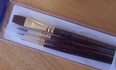
There are times, though, when the job needs a good brush, and for those times I have the set shown below, which I think are made of nylon or something similar. They have lovely spring and precision and are a joy to work with. They were far from cheap so I'm taking the very greatest care of them.