Wednesday, December 31, 2008

Endings and beginnings


Last night I finished essay No. 2 of 2 for this course, on "Illusion and paint handling". It feels great to have it out of the way. I've been researching it for months and writing it for weeks, including paring it down to fit into the word count. In these painting courses I'm better able to predict when an essay will be done than a painting. Does this mean I'm in the wrong field? I still have a lot of logbook stuff to put into a coherent form but the essentials are in the notebook. So, nose to the grindstone, the end of this tunnel is in sight. And I'm so looking forward to getting onto the advanced painting course, which I've already signed up for and which is really exciting, and also the printmaking course which I've also signed up for and which is even more exciting. Last week I sneaked in a couple of rank beginner monoprints and was transported. Such possibilities! 
.

Tuesday, December 30, 2008

Series overview


The work goes on and the pieces accumulate. Every day I lose faith in the series and in myself and every day I tell myself to just push on, it's got to be done. This is a literal snapshot of where it's at right now, with a long way to go and a deadline in the middle of January. The pieces are at various stages, some more finished than others, the nearest one just started. I seem to be learning mostly how not to do stuff next time. For instance, I tried to give each of the pieces its own identity while maintaining a resemblance to the others. The idea was to avoid repetition. But I'm learning that a series needs a strong family resemblance and repetition, probably more than I have here. And too, I wouldn't embark on a series again where much of the information would have to come from photos. I tried a real live Trini sky in one and it just didn't work. So it goes!

Saturday, December 20, 2008

Words and pictures at the V&A

These are some sketchbook pages from an OCA sketchbook workshop that I attended in London at the Victoria and Albert Museum on October 12, 2008. In the afternoon session we had a choice of projects and most people including myself chose the "Walk around the V&A" option, drawing as we went. My aim was to do as many quick drawings as I could, of whatever caught my eye. The drawings and the notes tell their own story so here they are. The notes can be made big enough to read by clicking on the images to enlarge, though I can't say the same for the handwriting.


Thursday, December 4, 2008

Beginnings 1.4


Since the last stage I've done some soul-searching, which led to re-thinking both the concept and the individual pieces. It ended up with simplifying the concept even further so that it's now down to remembered landscapes. This one has changed somewhat but not as much as some of the others. It will stay like this for a while because I'll be putting it aside for the time being until some of the others are done.

Earlier stages:

Stage 1
Stage 2
Stage 3

Related posts:

Choosing a theme

Thursday, November 27, 2008

First reasonable screenprint

It's taken a few months but I've finally got a reasonable silkscreen print, in fact four of them. I made the stencil with drawing fluid and screen filler and printed the image onto Grumbacher pastel paper which took the acrylic ink very well.


Each of the sheets of paper measures 18 x 12" and is a different colour. I hand-coloured one with metallic inks (below).

Sunday, November 23, 2008

Beginnings 1.3


Stage 3

Here's the next stage of this painting. Not an awful lot has been done, except I've repainted the sky again and put in the house. I'm working on the tree separately but am having misgivings about not only this painting but the whole series. Nothing like showing something in public to bring the issues into focus. If the photo seems a bit weird it's because I don't have a regular camera at the moment and took this rather awkwardly with a webcam. 

Earlier stages:

Monday, November 17, 2008

Twisted tube

I'll have no camera for a week or ten days and will be unable to post updates to the series until the new one arrives. Meanwhile, this picture shows how not to design a paint tube/cap.  The tube is more than half-full but when trying to get the cap off, the tube twists in the opposite direction and eventually springs a leak. (I've only had it happen with this brand. Other similar-looking paints open normally).


Thursday, November 13, 2008

Beginnings series, No 1 stage 2

Stage 2


The whole land area was too small, compressed into the lower third of the canvas. I didn't want the top of the land at the half-way mark either, so it's now at the Golden Section which is much better. I've repainted the sky, not sure I like it.


Stage 2

Earlier stages:
Stage 1

Monday, November 10, 2008

Beginnings series, No. 1 stage 1

The revised series for my major project is provisionally titled "Beginnings". In addition to the other things, I thought about the size, the surface and the medium. The maximum size is limited by the cost of sending the work to England eventually, but for this project I wouldn't be working at a large size anyway because of the silkscreen prints which will be part of the process. So the size will be 16 x 22", and the surface will be canvas which I like because it's versatile and tough. The medium can't be oil because of the silkscreens so I'll do the series in acrylic. I still have to decide between thick paint or thin and drippy paint in transparent layers. Either could work, and a combination of techniques could work too. I feel I will need to maintain some sort of consistency across the series, to bolster its identity, but I'll go with a combined approach for now to give myself flexibility. The first piece will be a sort of pilot. If it doesn't go well I may need to rethink the process.

Beginnings, first stage of first piece

The subject for the first piece is the same as the first one for the original "Transitions" project but with different handling, and this is the first stage, the basic division of the canvas, which I chose to do in thirds. After a couple of days of studying the result, I'm thinking I don't have enough space in the foreground and will need to fix that. But at least acrylic is easily overpainted and I can change it. I fear it will be a very ordinary landscape but at the same time I'm determined to be positive about it, it's been way too long already.

Friday, November 7, 2008

Testing

I'm posting this link to the Theme post again to see whether e-mail subscriptions are working, because yesterday's post didn't arrive in my mailbox as it should have. I've taken out some widgets in the sidebar in case they're affecting the mail-out in some way.

Thursday, November 6, 2008

Choosing a theme

I've been bedevilled by indecision for months now on the major project for my current level 3 Painting course at the Open College of the Arts. The task is a series of six paintings on a theme. It doesn't sound so difficult, so what's been the problem?

First, I had immense difficulty choosing the theme. Once you get to thinking about it, there's no such thing as an easy theme. Like an essay in an English course, a series needs a point of view. I think I'm an intuitive painter by nature, and in a way, the idea of painting a series is anti-intuitive. A series needs advance planning and may involve some repetition. But back some months ago I wasn't thinking along those lines. It was more a question of whether to choose something from the list of suggestions offered in the course book and just blaze away, or whether to devise something of my own, or what.

I did try something from the list. One of the options was "Flowers". I paint still life quite often so that would seem to be just the thing, but I didn't feel enthusiastic about it and it fizzled out. No point of view, I thought, or none that I was aware of. I might think diferently about that in future.

Eventually I did come up with a theme, provisionally called "Transitions" that I thought would be exciting to do and would stretch me as a painter. It would focus on different things that had
influenced me over the years. I worked on this for months, and produced a lot of stuff, including numerous experimental studies and a couple of attempts at finished pieces. But somehow, whenever I tried to map out how it would go overall, a sort of visual outline, I had trouble getting past four pieces.

One of the problems which I became aware of only gradually was that the "Transitions" idea, while it might be exciting, doesn't play to my strengths, which are drawing and painting from life. This is why "Flowers" or the "Park" might have been a better bet after all, and would be more in line with where I want my so-far non-existent style to go.

However, having put so much into the "Transitions" idea, I was reluctant to drop it altogether without resolution. I wanted to carry it through and see where it would take me. So I had another battle with the dreaded visual outline. I finally got one done, and looking at it objectively, along with research on famous themes such as Monet's Haystacks and Van Gogh's Sunflowers, it became clear that the project as conceived was much too broad and diverse and it lacked cohesion.

So, I narrowed it down and tightened it up, and it changed into more of a "Childhood" theme, which, surprise, surprise, is in the list. It still doesn't play to my strengths, because I live thousands of miles from where I grew up and have to work from family photos and memory. But it's more coherent as a series now, and once I got to this point, making a visual outline of the six pieces went more smoothly.

One of the things I've learned so far is that it's better not to go against one's nature if at all possible. But I'm still glad to be doing this project, however it turns out, because I need to get it out of my system.

I've also learned that, for a series, the visual outline should be done early rather than late. If it's not working out, something may be wrong with the concept.

I'm planning in the next few days or weeks to post one of the pieces in progress at different stages -- good, bad or awful.

Saturday, November 1, 2008

Brushes and acrylics

Click on photo to enlarge

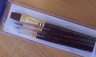
This is what acrylic does to brushes, I don't know why. It might be that the acrylic causes the bristles to become brittle so they break more easily. Such wearing-down doesn't happen with oils. For this reason I use cheap brushes for acrylics and replace them often. Just today I got four flats, sizes 7 to 9, for less than one US dollar each.

There are times, though, when the job needs a good brush, and for those times I have the set shown below, which I think are made of nylon or something similar. They have lovely spring and precision and are a joy to work with. They were far from cheap so I'm taking the very greatest care of them.


Wednesday, October 29, 2008

The goal of the century

This is off the beaten track for me, but Maradona is in the news again so we looked up the famous goal on YouTube, and here it is . . .  (against England, in Mexico in the 1986 World Cup)

Wednesday, October 22, 2008

Andy Warhol at the Hayward

I need to explain about Andy Warhol. I got interested in him only recently because I've been experimenting with silkscreen printing. I saw some boring Campbell's Soup Cans in New York and read about the Brillo boxes. But lately, looking closely at his silkscreens of Marilyn and Jackie and Elvis et al, and researching his process, and looking at the sizes and the colours while tossing my own efforts into the trash, it's been dawning on me how exceptional and brilliant these works are. What is astonishing about the Marilyns and the Jackies and the road accidents is Warhol's vision, and his boldness and originality in exploring what was at the time virtually a new art form. And the technical quality of the multi-colour silkscreens is just amazing. He did have technical help, but so do many artists who go into printmaking in a big way.

So, loaded down with packages after a morning's shopping, I made my way to the Hayward. To my relief they had a cloakroom where I was able to leave my stuff. Then I bought a ticket and went through the door and into another world.

And what a world it was . . . exotic, glitzy, over the top, utterly absorbing. The first surprise was the "screen tests". I could have watched them all day. They were showing continuously on three screens hanging from the ceiling, each screen about three feet by four feet or bigger. The "tests" consisted of the face of a person looking at the camera without moving or talking for over two minutes. There they were, in silence, huge close-up black and white head shots with a quiver of life, a blink here, a twitch of a lip there, steadily gazing into the camera. Very memorable, I don't know why.
Front cover of the exhibition guide handed out with the ticket

Also in the first room were a few lovely early drawings which show Warhol's sense of art. Some of the "Marilyn" silkscreens were on display and one of the large car accidents. Tall glass cases contained Warhol memorabilia -- letters, snapshots, press clippings and so on, including a letter from the deranged Valerie Solanas, the woman who shot him. There was lots to see and it was all well labelled.

The layout of the exhibition encouraged a natural flow without making the visitor feel regimented. After the display cases one wandered up a ramp to a sort of mezzanine which had several TV screens with earphones. One could just look, or look and listen. There were all sorts of odd little B/W movies, including one of the Kennedy family at the beach, homely and ordinary with the fascination of hindsight. Also I saw at least one movie of Warhol himself being interviewed. It went something like this: Warhol tells a story of how he took a photo of someone (it might have been Man Ray), and then how the other person took a photo of him, then he took another photo of the person, and the other person took another photo of him . . . and so on, and so on. How could that possibly be interesting? Don't ask me how, it just was. It was as if he was trying his utmost to bore the interviewer and was failing miserably.

Back cover of the guide

Another section had foam-lined alcoves set into the wall to sit in and listen to a sort of background chatter from various random audiotapes. The audio consisted of fragments of long-gone sound waves, people talking or calling in the distance or nearer by. They were weird but the chance to sit down was just fine.

One of the main sections consisted of a "room", demarcated by beaded curtains, containing perhaps fifteen or twenty TV screens, each with earphones and a star-shaped seat. These showed various interviews Warhol had done with celebrities for his TV series. I sat briefly at a couple. They were mildly interesting, but the real fascination was the ambience of the place and contemplating the possible motivations of this unusual person.

Several of Warhol's long movies were showing on loops in another dimly-lit room, with large screens disposed about the place and foam seating in between. It was all part of the flow. A door led from there into a room with some of the "silver clouds" bumping around near the ceiling. And from there another door led into the last room, which was decorated in red from top to bottom. It showed the story of Andy's life in photos, including some of the startling self-portraits, and an enlargement of the newspaper front page from the day after he was shot. "WARHOL SHOT, FIGHTS FOR LIFE" -- something like that, I didn't write it down.

Afterwards, reflecting on the show, I was struck by the loving care that had gone into putting it all together. Clearly it was more than just a matter of collecting and displaying the exhibits: a tremendous effort had been made to recreate something of Warhol's aura and ambience, his glamour and glitz, and to contrast these with his modest and unassuming persona when he was alive. I had no preconceptions beforehand, except for one disparaging newspaper review, and I came away from it feeling exceptionally good, and happy that I hadn't missed it.

* this link (a review of the show by Tara Booth) has several photos of the show, including a photo of the first room with the screen tests.

Tuesday, October 21, 2008

Miro, Calder, Giacometti and Braque at the Royal Academy

Burlington House, Piccadilly, is the home of Britain's Royal Academy of Arts. An imposing entryway leads into a courtyard surrounded by the building on all sides. Inside, an aura of power and tradition emanates in almost tangible waves from massive marble columns and dark old wood. A gracious staircase leads to the first floor, which contains a shop, and from there an incongruous glass staircase with open treads leads to the second floor and the exhibition I had come to see.

The show was called Miro, Calder, Giacometti and Braque. The catalogue explains the grouping -- the full title on the catalogue is Behind the Mirror, Aimé Maeght and His Artists, Bonnard, Matisse, Miro, Calder, Giacometti, Braque. It says, "The Galerie Maeght in Paris was one of the most influential and creative galleries of the modern era and its founder a key figure in the art world of post-war France." In fact most of the works in the show are from the collection of the Maeght family and from their Fondation Margeurite et Aimé Maeght in the south of France.


It proved to be a wonderful show, well worth the visit and the £9 admission price. The only problem was a touch of overcrowding at the time I was there -- the show itself was crammed with art, on the walls and in glass cases, with almost no space between the various pieces on display. The rooms were crowded with people too, so much so that at times it was difficult to look at a piece of art without feeling that one was in someone's way. In the end I kind of gave up and bought the illustrated catalogue to peruse at leisure without feeling jostled and pushed. But I lingered by and very much liked a couple of Giacometti paintings, looking as fresh as if they were done yesterday, and some books of poetry illustrated by Miro and Alexander Calder and published by Maeght. The highlights of the show were Braque's medium to large "Atelier" paintings which I'm glad to have seen, they are very fascinating and beautiful.

A glimpse of two Braque paintings in the catalogue

Sunday, October 19, 2008

New Chinese Art at the new Saatchi Gallery

London is a fabulous place for the art lover to visit. With its top quality museums and galleries, and the incredibly amazing underground system, the visitor can get to see a great deal in a short time.

In my case the time was very short as I had only a day and a half to spare due to all sorts of other commitments, including two full-day OCA workshops. The list was long and I couldn't do it all, so eventually I skipped two major shows and went to three others that looked interesting.

One of the shows I skipped was the highly acclaimed Rothko show at the Tate. I had spent a lot of time in 2005 in the Tate's Rothko Room and the works did nothing for me. This show was supposed to be better, but although getting around London is easy with a season ticket, a lot of walking must still be done, both in and out of galleries, and time must still be found or made or taken away from other things. So Rothko got left out.

The other big show I missed was Francis Bacon, also at the Tate. I'm not a Bacon fan and this would have been more duty than pleasure. It wasn't a priority, so that got the chop too.

Instead, allocating a half day each, I chose these three shows: New Chinese Art at the Saatchi Gallery; Miro, Calder, Giacometti and Braque at the Royal Academy; and Andy Warhol at the Hayward. I enjoyed all three immensely and doubt I could have said that about Rothko or Bacon.

The new Saatchi Gallery on the King's Road was itself worth a visit though it's not quite finished -- no cafe yet, for instance, and each of the large light spaces needs a bench or two for tired backs. Entrance was free and there was a small illustrated catalogue on sale for 1.50 sterling, containing thumbnail B/W photos of every piece accompanied by clear explanatory text. It seemed to me a model for the ideal catalogue to walk around a show with.


The little B/W Saatchi catalogue

Another good thing about this show, there were no ropes or barriers in front of the pieces, so one could closely inspect the paint handling, which was extremely impressive and professional in every case, ranging from the heavily ridged impasto of Li Songsong, to the smooth and brushless oil painting with no sinking in of Zhang Xiaogang, the well-known painter of monochrome grey faces with patches of pale colour. Among the works I liked best were two pieces by Zhang Huan, monumental tonal drawings made of incense ash on canvas. To me they showed a "sense of art" that one doesn't often see. I also liked the landscapes of Zeng Fanzhi, who paints with two brushes.

Most memorable of the exhibits, however, were the life-size figures by the controversial collaboration of Sun Yuan and Peng Yu. The detail in these was unnerving -- perfect fingernails for instance, freckled skin, even bluish veins showing under the skin. The two have been known to work with baby cadavers, and I confess to wondering just how these figures were made. The catalogue doesn't say what materials were used, it just says "life-size sculptures".

The whole Saatchi environment was friendly and helpful and a good experience. Even the lack of a cafe wasn't a problem because there are several restaurants nearby, both indoor and outdoor, in an adjoining pedestrian-only street.

Thursday, September 25, 2008

A quote

First come the innovators
Then come the imitators
Then come the idiots.

Heard last night on TV, ? Fox News, spoken by Mark Cuban in relation to finance. 

Monday, September 22, 2008

Worldwide Paint-Out

The Trinidad Art Society's Plein Air group took part in the 6th Annual Worldwide Paint Out on September 5-7, 2008. On Sunday 7, about a dozen members of the group met opposite Stollmeyer's Castle in the Savannah from around 9 a.m.  More info here.

The Art Society provided a spacious tent which turned out to be a godsend. Shortly after midday one of the worst downpours of the rainy season drenched practically the whole of Trinidad and put a stop to any further outdoor painting for the day. Up to that point the weather was bright and sunny and we had a pretty good turnout and a good day. I took along a bunch of very small boards, about a dozen, but managed only three small sketches before the rains came. These two are acrylic, about 6" x 8".


Sunday, August 24, 2008

What about gouache?

Gouache is my favourite medium for quick colour studies. The main advantages are speed and opacity. It takes just minutes to get going, and unlike watercolours, the paints are opaque and can be painted onto any old paper, white or tinted or ordinary brown, going straight to lights and darks and middle tones without fuss or bother.

Good quality gouache paints go on smoothly and spread easily and are a pleasure to use. Only a small amount of each colour is needed on the palette. These shown here have good coverage and tinting strength -- a little goes a long way.

The paints are not waterproof which is both a plus and a minus. Any spills or splashes are easily cleaned up, unlike oil and acrylic, which need more advance preparation. Even if the paint dries accidentally in a brush it can be washed out. Also, only one brush is needed. The sable brush shown here is the only brush I've used for gouache for several years now.


The disadvantage of not being waterproof is that dried paint already on the paper may dissolve when overpainting. This doesn't bother me, I just accept the new mix or paint more thickly, depending on what I'm aiming for.

The gouache colour studies shown below, Road 1 and Road 2, both about 8.5 x 11", were each done in about 30 minutes. They are only studies and I confess I don't think of my own gouaches as finished pieces, they're just steps on the way to something else. Many painters take gouache to a high level of finish.

So, in a nutshell, for me gouache is a great way to try out ideas and to generate new ideas, because one thing does have a way of leading to another.


.

Wednesday, August 20, 2008

Writers on Artists


Writers on Artists

In association with Modern Painters
DK Publishing, Inc. (2001)

Billed as "A collection of great writing on art by some of the world's leading novelists, poets, critics, and artists from the pages of Modern Painters magazine. Foreword by A.S. Byatt"

I got this book from the library last week and it's great. It consists of reviews and interviews from eighteen years of Modern Painters magazine. I've read only a few so far, dipping here and there into some that jumped out (e.g. David Hockney on Picasso, Matthew Collings on Jeff Koons), but now I've started over at the beginning and am reading it all the way through.

Many of the articles are interviews and this makes the book fresh and up to date and compelling. For instance, Matthew Collings asks Jeff Koons whether he really means what he says, and goes on, "It's like a fairground spiel, isn't it? -- the 'Jeff Koons Show'? Koons says, "Absolutely. This is 'Jeff Koons Entertainment.' I believe in art as a communicative device that's part of the entertainment world. It participates in 'showtime.' It just draws a slightly different audience than other entertainment vehicles."

Later in the interview MC asks, "What about more old fashioned artists who just want to paint Nature and the model in the studio and so forth?" JK says, "Well, if they weren't allowed to do that, then that's the thing we'd all want to start doing . . . there has to be this conservative aspect of course. If it was banned then pretty soon radical artists would be moving into that void. Somebody's got to maintain it, otherwise we'd all be back in there fighting for Nature again."


Each article consists of about 2,000 to 3,000 words, and is generously illustrated. The pictures have all the necessary information -- date, medium, size in inches and cm, and location.

The book contains 40 of these articles in all, making it a substantial and satisfying read. Here's a few selected writers/artists from the list which is too long to type in full: Howard Jacobson on Andy Warhol, Germaine Greer on Paula Rego, Jed Perl on Henri Matisse, Will Self on Damien Hirst, Julian Barnes on Edgar Degas, David Bowie on Tracey Emin, A.S. Byatt on Patrick Heron, Jules Olitski on Himself, Seamus Heaney on Barrie Cooke, and many more. Enjoy!

.

Sunday, August 10, 2008

Some drawing criteria

Mademoiselle Lacaux, by Auguste Renoir

I've always thought that Renoir was a brilliant draftsman and that everyone else would think so too. But it's by no means a universal view, and in the end it's a matter of taste and how different people define drawing. In fact there's no universally accepted definition of drawing, and it's futile to devote too much time to thinking about it.

However, it's important to me personally to have my own understanding of what drawing is, and especially what good drawing is, because otherwise how do I know what I'm striving for, and whether or not I've achieved it?

These are the criteria I use to judge drawings, my own and others:

Unity. Everything in nature has intrinsic unity. If the unity is disrupted or broken the object ceases to have life or to be itself, or the drawing is not convincing. Unity in a drawing is easiest to see in figure drawings, especially hands, and in animal drawings; but there's unity in everything, including landscapes and man-made objects. For an example of a lack of unity, imagine a drawing of a flower pot that looks as if it's made of plasticene.

Balance. I've blogged about balance in drawing before (A sense of balance). The kind of balance I mean relates to the law of gravity and it can be sensed or felt with one's own body rather than seen. A lack of balance in a drawn or painted figure or object is to me a fatal flaw, especially if it's my own drawing, unless there's a compelling reason for it to be like that.

Three dimensional form. A drawing that gives a solid illusion of three dimensions on a flat surface is a beautiful thing to see. Dark and light tones (or "shading") can help to achieve it, but there's more to it than that because a seemingly flat silhouette, or a simple contour, can give a convincing sense of three dimensional form with no shading at all. What it means is that drawing is a more complex and mysterious skill than at first it seems.

Life. Achieving a feeling of life is tied up with unity, balance and three dimensions. There's a magical quality about a sense of life in a drawing or painting, and if the work has life, then other shortcomings might be overlooked.

Renoir's painting of Mlle. Lacaux has all these qualities -- unity, balance, three dimensions and life, satisfying all my criteria. I wish I could draw like that.

Oddly enough, Picasso's sketchbook drawings of invented "creatures" (links below*) satisfy all my criteria too. The fact that they have 'life" is especially remarkable because these particular drawings are of invented inanimate clunky objects which could be carved from wood or plaster.


Some of Picasso's invented forms from 1927:
(first link, bottom of page; second link, top of page)
http://picasso.csdl.tamu.edu/picasso/WorksIndex?Year=1927&ViewStyle=gallery&CurrentItem=31

http://picasso.csdl.tamu.edu/picasso/WorksIndex?Year=1927&ViewStyle=gallery&CurrentItem=61

Some of Picasso's invented forms from 1933 (titled "An Anatomy")(first link, bottom of page; second link, top of page)

http://picasso.csdl.tamu.edu/picasso/WorksIndex?Year=1933&ViewStyle=gallery&CurrentItem=31

http://picasso.csdl.tamu.edu/picasso/WorksIndex?Year=1933&ViewStyle=gallery&CurrentItem=61


*Edited 17 June 2013: Those links were to The Online Picasso Project website which sad to say has since been closed to the public. Neither can I find those images anywhere else. It may be worth tracking down a copy of the big book by Carsten-Peter Warncke and Ingo Walther titled "Picasso" which has more than 700 well illustrated pages. I don't think the sketches referred to above are in it but there's a chapter in the middle called "A Juggler of Form", starting page 305, which has a variety of his other inventions.


Wednesday, August 6, 2008

A home-made portfolio


Click on the image to enlarge

This is a rough and ready portfolio made out of cardboard and canvas offcuts. It fits artwork up to 18 x 12" and I use it to send work to my OCA tutor, in a padded and waterproof envelope of the biggest size in the shop. In fact the biggest-size envelope isn't big enough, it needs a small extension, again made of cardboard and fixed to the envelope with duct tape. For the portfolio itself I prefer canvas offcuts and white glue because duct tape is so sticky that it can be a nuisance, for instance inside the pocket.  

The portfolio isn't pretty but it's functional and it easily accommodates twenty sheets or more. The top edge has a cardboard flap, and since taking this photo I've added a canvas strip from the flap to the front of the pocket, to prevent anything from falling out at the top if the portfolio is inadvertantly handled upside down.

Added Feb 12, 2012: I've put an improved version of the portfolio at http://artclasses.maryadam.com/home-made-portfolio.html. It's a PDF with step-by-step pictures showing how it's made.

Saturday, August 2, 2008

The old screen, a trial run


The screen has been exposed, only 12 minutes, and the picture shows the "open" screen after washing out the image. It looks better than the last time but it's still not great. I decided to do a trial run anyway to see what other issues might crop up.


The proofs drying on a line. 

Pulling the proofs was one of the messiest things I've ever done in my studio, it would be better somewhere outside the house like under the eaves. The proofs didn't turn out all that well, as expected, and unfortunately the screen fabric got a small tear during overzealous clean up.  It will last for another short run or two and then I'll replace the fabric. Other than that -- it was terrific to be pulling prints and I like the potential that this technique has for future work.

.

Thursday, July 31, 2008

A quote from Paul Klee


"In my productive activity, every time a type grows beyond the stage of its genesis, and I have about reached the goal, the intensity gets lost very quickly, and I have to look for new ways. It is precisely the way which is productive -- this is the essential thing; becoming is more important than being.


Graphic work as the expressive movement of the hand holding the recording pencil -- which is essentially how I practice it -- is so fundamentally different from dealing with tone and colour that one can use this technique quite well in the dark, even in the blackest night. On the other hand, tone (movement from light to dark) presupposes some light, and color presupposes a great deal of light."


[1914]

Paul Klee, in The Diaries of Paul Klee, University of California Press, Berkeley, 1964

Saturday, July 26, 2008

Screen print, a failed attempt

My first attempt to make a screen print has failed.

The image, a detailed drawing of a tree, was ideal for a photo stencil, so yesterday I prepared the screen with photo emulsion and left it in the dark to dry. Today I set up the light -- a 150-watt flood lamp attached to a piece of 3 x 1" board -- and gave the screen an exposure of 24 minutes.


Sad to say, the unexposed parts of the screen (the drawing) failed to "open" properly afterwards and in the end I had to abandon it and wash out the whole screen, which was pretty difficult to do. It took over an hour of scrubbing and washing with chemicals.

I think the exposure time was too long. I will try again with a shorter exposure and possibly raise the lamp a couple of inches.

I can't complain, having skipped the step in the reference book* which recommends doing a series of timed test exposures.

*Screen Printing, Contemporary Methods and Materials by Frances and Norman Lassiter, 1978, Hunt Manufacturing, Philadelphia

Tuesday, July 22, 2008

David Hockney's landscapes

[The links are to images]

Hockney's big Yorkshire landscapes done in 2006-2007 came as a surprise. Last I knew, he was doing large double portraits on four full sheets of watercolour paper with the subjects sitting on swivel chairs. It was a long series and they're already looking better as time goes by, though it's getting more difficult to find good examples on the internet, as the poor quality of the National Portrait Gallery image shows.

Then there were the dog paintings which brought him widespread scorn. These were and are considered trivial and sentimental, a view I do not share. At the very least, the length of the series shows Hockney's commitment to hard work.

Before that he did a series of landscapes in California, of Mulholland Drive and Nicholl's Canyon. These were large and colourful with the landscape spread out as if seen from a high viewpoint or even from the air. A few years ago I thought they might have been a little forced but now they're growing in stature, so to speak, and are fascinating images, visual extravaganzas. A later painting of the Grand Canyon is on sixty canvases.

In the 1980s, Hockney did his cubist-inspired photo-collages, with multiple shots taken from different angles and then cut up and pasted together, as in the iconic Pearblossom Highway (1986, photographic collage, 198 x 282 cm.) These too did not receive much critical acclaim but once again they are looking better with the passage of time. Furthermore, one can see how these cut-up and juxtaposed images could have led to his subsequent work -- the double portraits on four sheets of paper, the Grand Canyon paintings made up of dozens of smaller canvases put together; and now the monumental landscapes of East Yorkshire, each on 10 or 12 canvases. The biggest one is on fifty canvases and was painted for the Royal Academy's 2007 summer show.

Astonishingly, the Yorkshire landscapes were done outdoors, from life. Thus, Hockney achieves the spontaneity of painting outdoors at a scale never attempted before, to my knowledge, underscoring how innovative and exciting these pieces are.

Hockney's process involved transporting all his gear in a pick-up truck and setting up several easels together; and then working furiously for several days in succession. He might have had a tent as well, and helpers to lift and carry and set the equipment up, but I'm just guessing. This link tells how he used digital technology to help him see the painting's overall progress as if he was standing back from it. It also has a photo of Hockney outdoors, at work on an array of easels.

However he did it, I have the greatest admiration for the work. His strength has always been his gift for drawing which for the last fifty years has been a liability. Hockney plodded along on his own path, disregarding fashion and doing what he did best. Just turned 70 and with a huge body of work behind him, he didn't stagnate, he's still breaking new ground, and you have to admire that.

The only problem with Hockney now, and it's a disappointing one, is the lockdown on images. Unfortunately good examples of his work are becoming harder to find on the internet because of strict enforcement of copyright. Artists get known through their work being seen and it's risky to prevent people from seeing it. Hockney may be sufficiently well regarded now that he can afford to do this, joining the ranks of only the most illustrious of painters such as Picasso, Klee and Warhol, but it antagonizes many in the Wikipedia and Open Source generation and is potentially counter- productive. For myself, I declined to go further when I met the "STOP" sign on the official Hockney website.

.

Saturday, July 19, 2008

Watercolour kit part 2

The watercolour kit is now complete. I added a brush in addition to the one that came with the paint box. The new brush is a Rowney series S 34 sable, No. 4, and it has a great point and good spring. It came with a clear plastic guard which fits over the hairs to prevent damage from bending, e.g. against the side of the case.

Here's all the stuff together: a zipper pencil case, a Moleskine sketchbook/notebook about 3 x 5", a Micron 05 black pen with archival ink, a pencil, the sable brush, the paint box and the water bottle.


It all fitted in, really! And there's room for an eraser, a sharpener, and a folded tissue as a rag.


.

Tuesday, July 15, 2008

Whatever happened to manila paper?

The Plein Air group held a well-attended still life studio last Saturday at the Art Society building. Peter Sheppard arranged it and brought props (flowers and fruit, pots and pans) for four set-ups. Tables and chairs were in plentiful supply because of the current children's art camp organized by the art society.


I took along drawing gear as well as acrylics and a canvas, which turned out to be overly optimistic. I arrived late and left early and did only two drawings in the end, on brown paper.

Which brings up the matter of brown paper. It's cheap, which encourages using it freely and doing many drawings. Apart from being cheap, I like it because it gives you a middle tone to work out of. It's ideal for quick compositional studies with charcoal or Conté, either black and white or a range of colours. On Saturday I did one of each, not very good but shown below anyway (about 16 x 20 in. each).


Brown paper takes gouache fairly well too. But for wet media it's nowhere near as good as real manila paper, which disappeared off the market about ten or fifteen years ago, maybe more. Manila paper was cheap, tough, excellent to work on with both wet and dry media, and the plant it was made from (hemp) was easy to grow in large quantities.

I tried to find out what happened to it, and the only explanation I could find is that the plant may have been banned under the international drug laws. I don't know if this is the real reason and haven't researched it recently, that was a few years ago.

Sunday, July 13, 2008

The old screen, part 2

It's taken a while but finally, after some unforeseen delays, I got replacement hinges for the old screen. I put them on last night and here are two pictures. The first one shows the newly-installed hinges, and the second shows the screen propped up, as it will be in use, e.g. when changing the paper. Ideally it would have a swing-arm on the right (far) side to prop it up in between prints, but for now there's a clothes peg holding it up.


In the first picture you can just about see the removable pins in the hinges, both facing away from the centre. They're rather stiff, hope they'll get easier to remove and replace over time. Or maybe I should oil them.

It's easy to buy ready-made screens at some art suppliers, so why go to such lengths to reclaim this old one? I don't quite know myself actually. Casting around for reasons I can see that it revives a connection with the past and gives me a means of making different kinds of marks for very little outlay. Or, as an incurable hoarder, is it rather the satisfaction of being able to say that something came in handy after all? (Hoarders live for such moments.)

But I must produce something with it before I can say that.

-

Tuesday, July 8, 2008

Watercolour travel kit

I've been feeling a need to add colour to my sketchbook, so I went looking for a small neat folding watercolour kit. Pastels are fine except for smudging, and I do use them outside, but not in a standard sketchbook with white pages. Gouache would be good too, didn't think of it at the time. Coloured pencils are too slow and need too much pressure. Watercolour pencils aren't bad. Markers -- well, it's no harm to have them but I don't use them much. Watercolour it would be.

I found dozens of watercolour kits in all price ranges, some quite elaborate costing over US$100, but I was looking for something simple and inexpensive. I settled on the little box shown here and am very happy with it, except that the brush is hopeless. The box, along with a much smaller sketchbook than the one shown*, and a tiny water bottle (a reclaimed airline rum sample bottle), fits in a zipper pencil case, good to go.


The kit performs well in actual use (apart from the brush) -- the pans have body and moisture and you can work up a good thick brush-load of colour. Actually, the brush isn't hopeless, it has good spring, it's just very small and thin. One of the things I like about this particular kit is that the colours are mostly permanent except for Viridian and Alizarin. Not that permanence is an issue in a sketchbook, but even so.

As for the brush -- I'll get a thicker one as well and cut the handle down to fit in the pencil case.

A selection of travel kits:
http://www.dickblick.com/categories/watercolorsets/watercolortravelkits/details/

This kit is by Winsor & Newton and is called the Cotman mini watercolour set -- US$23.59, item No. 00325-1039 at Dick Blick, http://www.dickblick.com/items/00325-1039/

The kit closed. The silvery thing is the brush slotting neatly into the cover.

*The sketchbook in the picture is hardcover, 8.5 x 11".

.

Saturday, July 5, 2008

Picasso's way of working


In The Family of Saltimbanques Picasso achieved a universal quality, mysterious and poignant, that lifts it out of the realm of ordinary genre. His studies for the painting show how he worked, with numerous studies of variations of the group and of the individual figures. Many of them are available at the click of a mouse in the Online Picasso Project (list of links below).

[Edited 17 June 2013: Unfortunately the Online Picasso Project has since been closed to the public.]

It could have been a sketchbook drawing at the races that inspired the picture. The first compositional study shows the main grouping, without the woman at lower right, with horse-racing in the background. In the final painting the background is plain and featureless; just barren earth and sky, similar to the "Boy with a Horse".

Seeing Picasso's approach is nothing short of inspiring. It's an encouragement to stop labouring over a study that's going nowhere and instead to do another, and another and another.

And too, as an OCA student, it validates the OCA's teaching methods. You have to do "studies" from the first project in the first painting course. At the beginning I found it irritating -- why do yet another charcoal drawing when I already have a perfectly good one? But over time it has become second nature and, although I'll never be another Picasso (sad to say), I'm attempting things I would never have done before and I can see the value of all the drill.

Links to the Online Picasso Project: Click on the picture to see a bigger version. Also, you will surely find more sketches and studies by looking through the catalogue for 1905.
Boy Leading a Horse
http://picasso.csdl.tamu.edu/picasso/WorksInfo?CatID=OPP.06:012

1905

Acrobat and Young Harlequin
http://picasso.csdl.tamu.edu/picasso/WorksInfo?CatID=OPP.05:004

Boy with Dog
http://picasso.csdl.tamu.edu/picasso/WorksInfo?CatID=OPP.05:016
Two Acrobats with Dog
http://picasso.csdl.tamu.edu/picasso/WorksInfo?CatID=OPP.05:017
Bouffon with Young Acrobat
http://picasso.csdl.tamu.edu/picasso/WorksInfo?CatID=OPP.05:010
Study for Saltimbanques
http://picasso.csdl.tamu.edu/picasso/WorksInfo?CatID=OPP.05:014
A sketchbook study for the Saltimbanques
http://picasso.csdl.tamu.edu/picasso/WorksInfo?CatID=OPP.05:110

Gros Buffon Assis
http://picasso.csdl.tamu.edu/picasso/WorksInfo?CatID=OPP.05:034
Young Girl with Dog
http://picasso.csdl.tamu.edu/picasso/WorksInfo?CatID=OPP.05:272
Mallorquine
http://picasso.csdl.tamu.edu/picasso/WorksInfo?CatID=OPP.05:005

The Family of Saltimbanques
http://picasso.csdl.tamu.edu/picasso/WorksInfo?CatID=OPP.05:002

Thursday, July 3, 2008

John Cheever, from the Journals

By John Cheever, from The Journals of John Cheever

"I open Nabokov and am charmed by this spectrum of
ambiguities, the marvellous atmosphere of untruth; and I am interested in his methods and find them very sympathetic, but his imagery -- the shadow of a magician against a shimmery curtain, and all those sugared violets -- is not mine. The house I was raised in had its charms, but my father hung his underwear from a nail he had driven into the back of the bathroom door, and while I know something about the Riviera I am not a Russian aristocrat polished in Paris. My prose style will always be to a degree matter-of-fact."

[1963]

Alfred A Knopf, New York, 1991, ISBN 0-394-57274-1 (this is the first edition and represents a fraction of Cheever's journals. A new edition was published last year.)

Wednesday, June 25, 2008

Watercolour brushes

1. Da Vinci Maestro, dry

2. Da Vinci, wet, showing spring

3. Da Vinci, wet, showing point

4. Talens, wet, with worn tip

These are two great watercolour brushes that I've had for many years. The bigger one (1, 2 and 3) is a Da Vinci Maestro No. 12 Series 10, Kolinsky sable, which I use only for transparent watercolour (e.g. Ballinspittle, below). The smaller one (4) is a Talens No. 10 Series 110 pure red sable which I use mostly for gouache (e.g. the Dog study for an OCA course, below).

In fact I use the Talens brush a good deal more than the Da Vinci because I use gouache very often, and pure watercolour quite rarely. I bought the Talens at Deltex in Trinidad at least ten years ago for about US$20 and use it so much that the point has become somewhat worn. I bought the Da Vinci in London in 2002 for about US $100. They were both expensive but they've both earned their keep.

I did the testing routine with water in both cases when I was buying them. That is, I asked the assistant in the store for water to test the spring and the point. To test the point, wet the brush in the water, then take it out and give it a quick shake with a flick of the wrist. A first-rate brush will come to an extremely fine point, as in photo 3. To test the spring, draw the wet brush across the back of the hand to bend the hairs (photo 2). When you remove it the body of the brush should spring back in line with the handle. The photo shows that the spring in this brush is not perfect, but it's pretty good and has performed well.

These are the only brushes I need for watercolour and gouache. I wouldn't ever use either of them for acrylic which is very hard on brushes.


Near Ballinspittle, watercolour, 9 x 12", 2002

Dog study No. 6, gouache, 2007, about 12 x 16" (A3)

.