 |
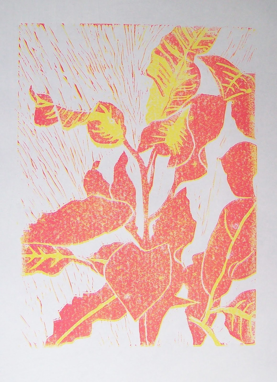
| Croton reduction linocut, the second colour |
This colour didn't print as smoothly as the yellow, the ink was a different consistency and was tending to separate in the tube. I blended it as well as I could on the glass with a palette knife. I'm hoping the slightly mottled effect won't be a problem, maybe it will have a charm of its own. So far my registration system is working reasonably well. This was actually printed several days ago, I'm only now getting round to posting it.
Still looking good - even though you say the consistency of the yellow was a bit of a problem. Looking forward to the next stage.
ReplyDeleteLynn
Thanks Lynn. That one was a few days ago so the next stage is coming up soon.
ReplyDeleteI agree that it is looking good. The mottling in the red could be a very effective contrast/base for other colours. Looking forward to the next stage!
ReplyDelete