Sunday, June 19, 2011

Tree, Chaguaramas 3

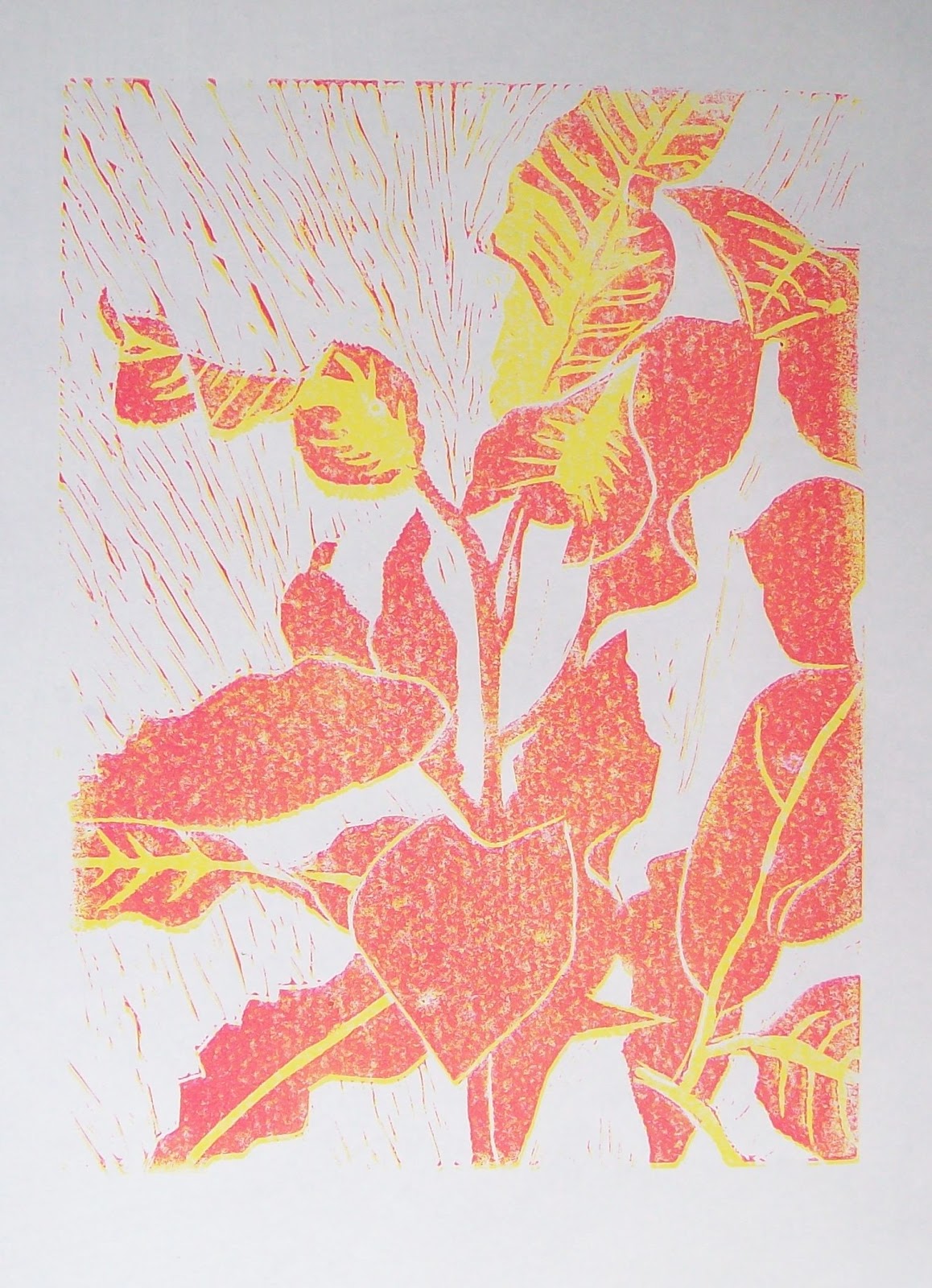
Although I haven't been posting I'm working on the tree and have started cutting the blocks. This time I'm making a separate block for each colour and this is the "separation" for the black block:

The "Black" separation for the Tree linocut (shaded areas)

The shaded areas will be left on the block and will be printed with black ink, everything else will be cut away.

It's funny, twenty years ago in 1991, it was all in the day's work to do sophisticated colour separations on the computer, everything automated and fantastic quality. Today, along with millions of others, I'm working out which shape goes on which block with pen and paper, and cutting it laboriously by hand, shaving by shaving, and getting satisfaction and enjoyment from the process. I feel there's some deep lesson to be learned if I could only think what it is.

Thursday, June 9, 2011

Tree, Chaguaramas 2

Feeling I didn't know the tree well enough I decided to make some exploratory studies. First I played around with the drawing in Gimp (or do you say, The Gimp?), which I'm just starting to learn.

Tree, digital manipulation of drawing
Then I made a collage, in fact am still working on it, there are some changes from this afternoon which are not in the photo . . .  I have no definite plan in mind yet.

Tree, collage
Still don't know it well enough so I made a drawing from a photo taken at the same time. This has more detail and gives me more of a feel for the tree. Am thinking I need to go back to Chaguaramas and do another drawing and find out what species it is -- the trunk looks as if it might be a young Banyan?

Tree, graphite
Don't seem to be anywhere near a print yet, this could take a while, much more than two weeks. It has become very interesting to me and I want to take time to explore it, wherever it may lead.

Monday, June 6, 2011

Tree, Chaguaramas


Tree, Chaguaramas, graphite

I've been looking for a drawing for a relief print and think I'll try this one which I did in Chaguaramas on Saturday May 15 on a drawing/painting day with a group from Women in Art. Will report progress as it goes along, though not necessarily every stage -- the print will take at least a couple of weeks. Haven't decided yet what techniques or colours I'll be using. Here goes . . . 

Tuesday, May 10, 2011

Yellow Poui


I took this on April 6, just got around to editing out the worst of the wobbles and barking dogs.

Saturday, April 30, 2011

Inventions?

After working on a painting for six weeks for the ASTT show on "Celebrating Forests for People", I decided at the last minute before taking it to frame that it didn't cut the mustard. I liked the first sketches, based on some photos I took in Lopinot last year. The painting in the end had a whole raft of techniques incorporated in it, not for the sake of it but each one for a specific reason or for some effect that I wanted. Some of the techniques might be my own inventions, I haven't heard of them before although I tend to think there's not much new under the sun in painting. I found myself not remarking on my "inventions" or even realizing I'd invented anything, only remembering them days afterwards when the matter of "invention" in art assessment came up in conversation and only then did I recall this ... and that .. and the other. Even now I have to rack my brain to remember those  so-called inventions. For example ... I started the painting off by taking prints from the final block of the croton linocut with different coloured water-based inks. My intention was to glue them to the board to give a subtle background texture of foliage and exuberant growth lines. Then again, water-based ink is not waterproof and I needed to overpaint in acrylic, so I tried spraying fixative over the prints. This worked fine and the inks didn't run when I painted acrylic on top. A useful thing to know.

The first sketch had an invention too.  I haven't read about it or seen it done, but I'm sure it must be used routinely by artists for roughs, it's so useful and quick and effective. The sketch was done with markers (Faber Castell Pitt pens) which are strongly coloured. To lighten the background I glued on tracing paper which worked well.

Forest sketch, markers on paper 9 x 12"
The downfall of the painting was one invention too many, when I added some oil-based printing ink to the last layer. I didn't like the resulting marks and tried to remove them with turps which was a mistake -- it got to be a little like Mr Bean with Whistler's mother.  So that's the story of the forest painting.  It wasn't a big loss, it didn't have anything of the freshness of the sketch above, they never do! I have to get  out of my head the idea that a spontaneous lively spur-of-the-moment drawing can easily be scaled up or translated to a different medium.

At the same time, I've gained confidence in my ability to invent and now realize I do it all the time without remarking on it even to myself. It's a matter of bringing unconscious things into consciousness which might not always be a good thing? Besides, I doubt any of these are new, they're things that happen naturally.  You encounter some sort of obstacle when making work and look around the environment for a way around it. I bet if I googled any of these I'd get pages of results.

Thursday, April 21, 2011

Who's who

Who's Who, mixed media, 12 x 16 ins
I did this for a change of pace in September 2010. It started as a doodle and after a while one thing led to another and I got lost in it which is always a nice thing to happen. There should be some familiar faces in there, if not then it's very badly drawn.


These are contemporary artists drawn from a UK magazine. I don't think either of them is recognizable but I like how the two drawings complement each other.

Added 23/4: These are the "originals" in the top drawing clockwise from top left:

Monday, April 11, 2011

Reading to pass the time

I'm twiddling thumbs and trying to make the time pass in a multitude of ways, waiting for results to arrive. Books are the best in this kind of scenario for occupying one's mind in pleasant ways. Here are a few I've just read or am reading.

The Girl with the Dragon Tattoo by Stieg Larsson, Vintage International. A novel by a Swedish writer set in Sweden. A terrific story. Translated from the Swedish. Published c. 2005. The author is dead now, what a pity.

The Bostonians by Henry James. Had this in the bookshelf for aeons, never read it. In fact I never got past the first few pages of any Henry James novel before. This one is going well so far, I'm on page 126. Writers have to be observant and be able to interpret what they observe and therefore they know a lot, and Henry James knows a lot. That plus flashes of brilliant imagery keeps the pages turning.

From the library (first visit in months):

Complete Photoshop CS3 for Digital Photographers by Colin Smith and Tim Cooper -- I wanted to find out how to do something in Photoshop. Found it out from this book and probably won't read any more. It looks pretty good if you have Photoshop (I don't).

Theories of Art Today, edited by Noel Carroll, University of Wisconsin Press. Twelve philosophical essays about the definition of art. One of the essays is about how art can't be defined. I'm planning to read two or three of them or at least try.

Assessment: Case studies, experience and practice from higher education, edited by Peter Schwartz and Graham Webb. London, Kogan Page, 2002.  Libraries are wonderful for books like this that you would never buy. On the blurb it says among other things: "Offering a compelling series of case studies, this book brings together a variety of assessment techniques. By taking the reader into real-life situations, it focuses on showing how assessment can provide a transparent and meaningful link between learning activities and desired learning outcomes".  I had high hopes for the book but have to say they were dashed. The "real-life situations" were often chatty anecdotes and there was not a lot of concrete information.

Under the Net, by Iris Murdoch, Penguin, first published by Chatto & Windus in 1954. An odd story, comic in places. The first part is dodgy, the second moves along at a brisk pace with many laughs.

Monday, March 28, 2011

Croton reduction linocut 6, final print

Croton reduction linocut, final print
This was done a couple of days ago, the prints are dry and packed away already. I'll take it out and look again in a month or two. I'm not sure if I prefer the last one with the brown-red ink, before the black was added. I toyed with the idea of stopping the run and letting it stay as it was; then went ahead, thinking that's what I planned, let me see it through. With future prints I will a) improve the registration system to reduce the number lost during the process, and b) when in doubt keep a few back at the penultimate stage. However I doubt that this exact situation will arise again.

Friday, March 25, 2011

Croton reduction linocut 5

Croton reduction linocut, fourth colour

It's not perfectly registered but I was pleased with this when lifting it off the block. The process is quicker now, the inking is less because so much has been cut away.

Thursday, March 24, 2011

Croton reduction linocut 4

Croton reduction lincut, the third colour

This one was disappointing. I lost the first four (out of twelve) because of mis-registration and took ages to figure out what was wrong. My system consists of a sheet of the same paper that I'm using for the print run taped to the work surface, with an outline of the block drawn on it, and with narrow strips of lino acting as guides. The guides stayed in place but the tape holding down the paper became unstuck allowing movement to take place. In a nutshell, the block shifted in relation to the guides when burnishing the back of the paper. I now know that I need to devise a better registration system.

After figuring it out and securing the base sheet, there was considerable improvement but it became evident that slight shifts had taken place in the earlier colours. So none of them will be spot-on perfect.

I'm not too cast down. It reminds me of a time some years ago when I was drawing a friend, a successful businesswoman. It didn't go well and the friend commented that she would never choose to do something with such a high failure rate. It made me stop and think ... I'm still thinking ... it's true, in art the failure rate is high but it's one of those things that one accepts as an artist, it's part of the job. The rate improves over time, with practice and experience, this I know for sure, my rate is far better than it was ten or fifteen years ago. Definitely a long term prospect though, no quick miracles in this field.

Right now I'm relatively new to printmaking and expect glitches to occur and one did and no harm, it's good experience. I will continue with this linocut (two more colours) and will be happy if I end up with three or four passable prints.

Tuesday, March 22, 2011

Croton reduction linocut 3, the second colour

Croton reduction linocut, the second colour
This colour didn't print as smoothly as the yellow, the ink was a different consistency and was tending to separate in the tube. I blended it as well as I could on the glass with a palette knife. I'm hoping the slightly mottled effect won't be a problem, maybe it will have a charm of its own. So far my registration system is working reasonably well. This was actually printed several days ago, I'm only now getting round to posting it.

Wednesday, March 16, 2011

Croton reduction linocut 2

Croton linocut in progress, the yellow block

Supplies arrived yesterday and the yellow is printed (hand-burnished) and hanging up to dry. Now to cut the same block for the next colour. I'm expecting to lose a few to mistakes during printing, I hope not more than one per colour. 


Saturday, March 5, 2011

Croton reduction linocut 1-- high hopes

Croton, first cut of the lino block, 12 x 9"
This is one of several small projects I have going on at the moment, some of them involving printmaking. It's a reduction linocut with five colours planned -- too ambitious, maybe, but I can't see a way of doing it with less. It could go horribly wrong at any time, a slip of the cutting tool and so on, but right now I'm hopeful, and keen to see it taking shape. I've used markers to indicate where some of the colours are, it's too easy to cut the wrong bits. I'll be printing it by hand unless I can find somewhere in Port of Spain with a relief press or etching press. 

There was a lot of preliminary work to get to this point. I didn't like the first drawing (which took hours) so I ditched it and started over, and a gouache study didn't look promising for making a painting. The strongly variegated foliage suggested that a linocut would be worth a try, so here goes. But of course I won't know until the end. 

I will update this as it goes along. I may have to stock up on paper or ink before printing the first colour. With a reduction linocut you get only one chance.

Thursday, February 24, 2011

Crowded drawing 4


I'm hesitant to put this here, it's such a mess but I'm not planning to do anything else to it. None of the crowded drawings are meant to be presentation standard, they're personal explorations, groping around, mostly in the dark. If I do any more I think I'd do them on separate sheets and not in a sketchbook. It's an interesting way to go about a drawing, having no idea where you're headed, just filling the page and overfilling it, disregarding which way is up, adding things willy nilly as they happen so that it's partly a record of day to day existence. This one is partly painted over with white acrylic and I found myself not wanting to paint over some parts and I'm trying to decide whether to just do it, do something I really like and then paint over it -- would that be good for the soul?

Thursday, February 10, 2011

Crowded drawing No. 3

Crowded drawing No. 3, pen, graphite and collage.

Not sure this one is crowded enough, I may have stopped too early. Also it's become too symmetrical which I didn't want. On the plus side, it works the other way up as well:


Still like the first one best. It was on a smaller page (8.5 x 11") which I don't have any of right now.This one here is 9.5 x 12". It's not that much bigger, it should be able to work, will probably try another. 


Monday, January 31, 2011

Birds in grass


Just a little pen drawing in sketchbook, half an A4 page. There's an idea behind it which I don't want to put into words yet, might scare it away.  

Friday, January 21, 2011

Crowded drawing No. 2

Page 12, graphite, ink, pen, collage
This is another crowded drawing like the one in an earlier post (which I've renamed). The idea of crowding a page with many unrelated elements came from a book and when I tried it out I liked the way the bits started to relate to each other in unexpected ways. And it forces one away from the figure-ground mindset. It'a another of those handy tools for the mental toolkit, something that could help to break through a block for instance. This one, a piece here and a piece there over several days from magazines, newspaper and the internet, seems to me not as good as the first, it's become a little self-conscious and heavy and the pieces hardly relate at all. But the individual pieces I like. I'm working on another and will post it when done.

Saturday, January 15, 2011

Two drawings

A roll-up pencil holder
The first drawing is of a canvas roll-up pencil holder that I got in a sale. It's similar to a brush holder, and like a brush holder it's open at the top which allows things to fall out, though generally they don't. Unrolled, it has a row of loops for keeping in place pencils, pens, graphite sticks etc, and a couple of bigger loops for things like a sharpener or eraser, plus there's a safety flap at the "lower" end. It doesn't sound as if it would be effective but I really like having my drawing things in there and prefer it to a box. The finishing is nice but not flexible, there's only one size/position where it rolls up tight enough so that the snap fastener keeps everything inside.

Layered abstract drawing, crayon and acrylic on paper, A4
The next drawing is very different. It was done with alternating layers of crayon and acrylic paint. I had forgotten it and found it yesterday when going through the work done for the course. This is a nice kind of thing to do if one's mind feels particularly blank, one can keep going indefinitely, adding layers that conceal or partly conceal the marks underneath.

Wednesday, January 12, 2011

Missing comments

Thanks to a friend who alerted me this morning to the fact that some comments she had posted had never appeared. On checking into it, I found a whole load of comments "awaiting moderation", going back to at least May 2010, possibly earlier. I would like to apologise sincerely to all those whose comments didn't appear or who might have thought I was ignoring them, I assure you that could never be the case. In fact I was a little sad at the lack of comments but felt, hey, that's the way it is in the blogosphere, mustn't let it get me down!

How it happened, as best I can figure. I never had comment moderation on before because comments were few and I got an email immediately so I could always delete any objectionable ones manually. Then someone started posting malicious stuff about someone who was mentioned in a post so I turned comment moderation on, and went about my business, thinking I'd continue to get email notifications. But it seems that turning moderation on has the effect of turning email notifications off and I didn't realize that. It's taken a while and I might never have known if Lynx hadn't alerted me. It's fixed now and once again my apologies to those whose comments have taken so long to appear.


Friday, December 31, 2010

Figures 2010

Total subscribers (email and RSS combined) = 95 (up from 60 a year ago)

Page views since this time last year = 15,933

Posts for the year = 34 (down from 40 in 2009)

Blank pages remaining in main sketchbook = 2, which I'm saving till the very end.

Happy New Year everyone.

Saturday, December 18, 2010

A landmark

Untitled (Free), mixed media on board, 50 x 75 cm

On Wednesday this week, after two intense years, I sent the last assignment of OCA's Painting 3 Advanced to my tutor. It's the last course for the degree, so this marks the end of that phase (still have the assessment process to get through). I often felt this point would never come, that I wouldn't make it or would be unable to finish the course for one reason or another, life catching up and so on.  It's a relief to have got here.

In the OCA system you finish up with a programme of study that you design yourself, which is supposed to take a year. I underestimated how much time my course would need and it stretched to two full roller-coaster years.  I've alienated a few friends and neglected or postponed numerous things along the way in a single-minded drive to get it done. It would have been a waste not to finish the job after investing the first four years, but I didn't expect it to take so long or to take over my life the way it did.

To make a long story short, and in appreciation to my friends and family who read and follow this blog, here is a link to some of the work. It's a selection of paintings and studies, mixed up together, some with the paint not yet dry.

I had put in a link to a folder of some work but after reflection have taken it out again. In the OCA system a tutor comments on the assignments as you go along, but no marking is done and no grades are given until the final assessment, that is, after the course is finished, so I am rather nervous about this lot, only too well aware that it may fall short of what is required. It will be a bit of a nail-biter but I will let you all know how it goes, one way or the other.


Thursday, December 9, 2010

Crowded drawing No. 1


Page 213

Without comment -- what is there to say about something like this?  

Thursday, November 25, 2010

Saeki, Clarke and Feelings


A drawing by Hiroe Saeki 


There was an exquisite drawing (not the one above) in the Royal Academy summer show that I found fascinating and beautiful, by Hiroe Saeki. I can't remember the actual drawing but I remember that it was highly detailed, with clean execution and a lot of pristine white paper around it, which is a feat in itself as anyone knows who does a lot of pencil drawing. Looking her up further, she's a Japanese artist who makes her drawings from imagination and nature. They have a meditative quality, sometimes whimsical. I wouldn't mind having one on my wall, one could get lost in it. They remind me a little bit of Leroy Clarke's intricate pen drawings. I recall on a visit to the National Museum not too long ago being wowed by Leroy's drawings again, and also marvelling at how well the paper had held up, with no mottling or discolouration. This poster showing Leroy's style of drawing is on the website of Bloomsbury Auctions. It may have browned over time since a poster wouldn't be printed on archival paper.

Poster for Leroy Clarke's 1972 exhibition in New York. 

The auction in question took place in 2009 and consisted of the drawings and paintings and art collection of one Tom Feelings, and that started off another digression which ended with this entry in the catalogue for a lot consisting of seventeen of Tom Feelings' sketchbooks, as follows:

"82. Tom FEELINGS (1933 - 2003). Collection of personal sketchbooks, early comic book designs, drawings and paintings. Includes: 17 sketchbooks both partially and fully completed, comic book designs, family portraits including a picture made at 6 years old and a painting of the artist’s aunt and drawing of his mother, other early drawings, studies and sketches.
est. $700 – $1000
Sold for $650
Sale NY040, 9th December 2009"
-- which could easily start yet another digression but i thought that was enough for one day. However I did look up Tom Feelings briefly. He was a famous American illustrator who created some powerful images of the slave trade which have left me feeling sobered and sad at man's sickening inhumanity to man.


Monday, November 22, 2010

Christo and Jeanne-Claude


A drawing for Surrounded Islands, 1982, Biscayne Bay, Florida, in two parts

I found these thoughts by Christo and Jeanne-Claude in a book called Through the Gates and Beyond by Jan Greenberg and Sandra Jordan, and copied them into my notebook:

Nobody can buy these projects.
Nobody can own these projects.
Nobody can charge tickets for these projects.
Even we do not own these projects.

And later, about The Gates, "It touches people. And it makes people happy."

(Jeanne-Claude died last year.)

http://christojeanneclaude.net/index.shtml

.

Sunday, November 7, 2010

Paul Henry, Irish landscape painter

Paul Henry (1876 -- 1958) was an Irish painter who specialized in paintings of the west of Ireland and who was popular during his lifetime. We had one of his paintings at home and I used to love looking at it. I still love his work, the way he saw and painted the greys which are so characteristic of Ireland's rainy landscapes, his "pale view of hills".  To me he is a painter who had something to say. He studied art in Belfast and Paris and is described as a Post-Impressionist on the Encyclopedia of Irish and world Art. I made this little gouache copy of  Rain on the Bog and while doing it marvelled at how economically he achieved his effects. Then again he painted landscapes like this over and over during his working life and must have known them off by heart in the end. 

After Paul Henry, Rain on the Bog (a fair copy though I say so myself).
The original of Rain on the Bog is an oil on canvas, 35.5 x 40.5 cm or 12 x 16" approx.


.

Thursday, October 28, 2010

Peter Doig: It has to feel like it's meant

Heidi Zuckerman: [sweetly] So what are some of the complications of making a painting?

Peter Doig: [hesitant] -- I don't know . . . For me . . . it has to be convincing . . . that's got nothing to do with good drawing, bad drawing . . . bad painting, good painting . . . it has to feel like it's meant, in a way . . . hard to describe I mean because sometimes that can happen quite quickly . . . sometimes it can happen over a long period of time . . .  it's very complicated . . . I think that as soon as you're shallow it's very apparent . . . have to try harder . . . not got anything to do with hard work or anything . . . it's just like a very very subtle thing, it's not really . . . it's kind of not in tune, it's like, you know, a piece of music even if it's discordant it's right, you know? Very hard to describe. The complications are purely between you and the work.

Transcribed from the fascinating Doig-Zuckerman interview


http://www.youtube.com/watch?v=Hbr28EeTCq8


Wednesday, October 20, 2010

Josef Albers, Interaction of Color

I've been reading Interaction of Color by Josef Albers (1888 - 1976) and doing some of the exercises. I like the book a lot. It's not dogmatic, rather he takes an enquiring approach, suggesting experiments that can be made to explore different colour interactions. The experiments are open-ended and can be extended in umpteen ways to suit oneself. Don't know how I've managed to miss this book for so long and can see why it's still so popular.


In this exercise I was trying out one colour on different backgrounds to suggest 'Young' (above) and 'Old' (below). I bent the rules a little by altering the quantities and shapes. 


Josef Albers, Interaction of Color, revised and expanded edition 2006. Yale University Press, New Haven & London. Originally published in 1963.

Tuesday, October 12, 2010

UK sketchbook

For want of something to post, two pages from the UK section of my sketchbook:


In Kensington Gardens (graphite, A5)


Wildflowers in North Wales (pen, A5) 

Tuesday, October 5, 2010

A weird installation


I forgot to mention an installation at the Saatchi Gallery. This was Richard Wilson's 20:50. I'd heard about it and had read recently that it shouldn't be missed, so made a separate trip just before leaving. I'm still puzzled by it, still don't understand how it's made and how it works. When you go in there (it's in one of the basement galleries) -- you stand at floor level looking down into the basement which is at a lower level. It appears  to be a huge empty room with the ceiling far above your head and the floor far below, with something odd and unnerving about it. I don't have the words even to describe it. The lower part of the room is evidently filled with oil, which stays perfectly still, not the slightest ripple. It looks like air, which sounds impossible. There's a faint smell of oil but no sign otherwise. The seemingly unsupported walkway leading out into the middle had a rope across it to indicate no entry.  Looking at the photo now, I'm wondering how they dust the window ledges, because evidently the installation is permanent and has been there for a couple of years. It just boggles the mind.

Monday, September 13, 2010

Back home now

Back home now and have just remembered that I didn't post anything last week, after posting once a week while on holiday which is way higher than my usual rate. It was because of all the museum and gallery visits, and the opportunity to write them up -- not something I really enjoy doing but it's advisable for the logbook.

In the second-to-last week I made a day-trip to Liverpool to the Walker Gallery to see Peter Doig's Blotter. The gallery was quiet and I spent an hour and a half with the painting, to my own surprise. I wouldn't normally do that to see just one painting but it was necessary because my essay is on him. Tate Britain has two of his paintings, Echo Lake and Ski Jacket, but unfortunately they're in storage, not on display. I applied for an appointment to see them but didn't hear back before leaving. So it was the Walker or nothing. I'm glad I went, the trip was well worth the time and effort. (The painting is under glass, the diagonal green line at upper left of the photo is a reflection of the gallery lights).


Peter Doig, Blotter, oil on canvas, Walker Gallery, Liverpool.

The last week was hectic in other ways. I met an OCA buddy, we talked for four hours solid. Absolutely the way to go for isolated distance-learning students out there, online doesn't do it at all. This was the fourth or fifth time I'd met a fellow student in person, after making contact through the website, and it just makes a huge difference and is worth going out of one's way for. Even to another city. So a big hi to my OCA buddies, it was wonderful meeting you all and hope it's not too long before we meet again.

The last item was a return visit to the British Museum to see the Parthenon marbles. You might think one would be jaded after seeing so much art over the eight weeks, but no . . . they are so incredible, so moving, it was the best possible way to end a fantastic trip.