Back in 2011 I made a short video about gesture drawing and uploaded it to YouTube. I had done it on a Mac and soon afterwards my Mac was stolen. A little while after that I realized the video needed editing but was unable to make the edits in Windows XP, so I withdrew it from YouTube until I could fix it. Only now, four years later, have I finally been able to edit it with MovieMaker in Windows 7. The edits were mainly cuts, and I added a few bits of explanatory text. So here it is belatedly. Hope someone gets something useful from it!
Showing posts with label drawing. Show all posts
Showing posts with label drawing. Show all posts
Thursday, April 30, 2015


Monday, September 23, 2013
Julian Opie, finding the poetry
Everything I've seen by Julian Opie has been well made. There's no sloppiness, no rough edges. If his work looks simple it's because he spends innumerable hours simplifying it. Take the beautiful walking figures ...
http://www.barbarakrakowgallery.com/julian-opie (Scroll down until you come to "Continuous computer animations" and click on the images.)
The video below is of an exhibition being installed in Italy. There are some fascinating images in it -- portraits with blinking eyes, a portrait where the background clouds are moving, another with a moving second hand on a watch ...
Much of the work is digital, done on computer, but he also draws and paints by hand. Drawing is where he's coming from. In an interview with Art World magazine in 2010, he talks about drawing:
Q4. How come the idea of representing people and landscape in a monochrome and uniform motion way? For instance, the album cover for Blur, the animation for the Expo.
Well that is what I do - I draw. Drawing is a process of making equivalents - of engaging in the world physically and emotionally - of casting your mind out and grasping what you see. To me it's as natural as walking or talking - I have been doing it since I was 11 - every day - I cannot explain any one drawing as it depends on the one before. I suppose this is the way I see the world - it's the closest I can get to reality. (http://www.julianopie.com/#/text/interview/2653)
My first experience of his work was during a visit to the Tate Modern in London in, I think, 2006. There was one of his life-size cars made of painted plywood (1996) which made me smile and lifted my spirits, I don't know why. Perhaps that's how he wants the viewer to feel. But thinking it is one thing, making it happen is another. The car forms are a marvel of simplifying and yet transforming the object into another kind of reality. I've found simplifying in general much harder to do than it looks. Julian Opie makes it look easy.
In an interview with the Journal of Contemporary Art, he said:
In an interview with the Journal of Contemporary Art, he said:
"One of the elements I am balancing is the degree to which something is generic and the degree to which something is specific. For instance, a real car: I don't think I could use this because it is too specific and then you have specificness: Whose car is this? How much does it cost? Do I want this car? All these questions would come in. And yet, if it is totally a symbol for a car. In terms of cars, you get to a point where you can't symbolize any further: when you symbolize a car as a hatch-back, you rule out sedans. There are some cars, and you see them on the street, usually it is an old sedan car, which have to changed eventually, because they don't look right anymore. Like telephones nobody uses anymore. They have lost their relationship to experience. Children will never use that telephone, although they will recognize the symbol. When it becomes only a symbol, it no longer seems to be useful to me. There is this double relation." Journal of Contemporary Art, http://www.jca-online.com/opie.html
And in a catalogue for an exhibition at the Tate, he said:
"I think my work is about trying to be happy … I want the world to seem like the kind of place you'd want to escape into … Mundane things are just as exciting as all the things you might imagine escaping into." -- http://www.tate.org.uk/art/artworks/opie-distant-music-water-traffic-p78521/text-summaryHis body of work is huge as seen in his website. He has also made public art for cities around the world on commission. Calgary is fortunate to have the one in the video below.
The figures have been described as "cartoon figures" -- I can't see them that way. To me the movement is marvellous, the way the heads bob just a little and the way the gait of each walker is different despite being pared down to essentials. This is easiest to see where a couple are walking together, such as Kris and Verity Walking, 2010 (in the Barbara Krakow gallery, link above). It reminds me of something in Shakespeare ... "Great Juno comes, I know her by her gait" *... and how amazingly true that is.
'It's difficult, modern life,' [Julian Opie] says. 'Everything is to a certain degree, spoilt. We're left with the choice of being appalled and trying to look away, or finding a way to take it all on board. Sometimes I cross Old Street roundabout and try to imagine that it's a river, and that these are boats passing by and isn't this nice, and we're waiting for a gap where I can cross the bridge… then the lights change and across I go. I find it amusing to do that. Not only that, it helps me, in a way. Trying to find the poetry.' -- from a Telegraph interview 2008. http://www.telegraph.co.uk/culture/art/3561659/Julian-Opie-sounds-original.html
* (The Tempest, Act 4, Scene 1)
Note: The link to the second video has been playing tricks. If the wrong video appears please let me know and try reloading the page.
Monday, September 16, 2013
Maracas Bay
 |
| Maracas Bay, pencil, © Mary Adam |
 |
| Maracas Bay, acrylic on canvas, 8 x 10", © Mary Adam |
Change of frequency for the newsletter
Based on the result of a survey in Newsletter #2, I will be changing the frequency of the newsletter to quarterly. Therefore the next issue will be in mid- to late November. If you didn't get the last issue and you're on Gmail, it may have gone into the "Promotions" tab. This happens even to me when I'm testing it, and to other emails that I subscribe to, so I have thrown out this Gmail feature. I don't know if there's a way around it.Result of the poll:
Monthly -- 3 votesBi-monthly -- 4 votes
Quarterly -- 6 votes
Other -- 0 votes
Monday, September 9, 2013
The butterfly incident
What happened wasn't enough to call it an "incident" but that's the word that comes to mind. I will try to relate it.
This morning I went outside to draw the plumbago. I do this often and have been doing so for years. I'm still getting to know it and trying to understand the way it grows which is extremely odd and unusual. As I was drawing, a little butterfly came along, a very tiny one. It fluttered around the plumbago, stopping on a leaf now and then. Then it fluttered off elsewhere. A few minutes later it was back. I had seen it yesterday too and noted that it seemed to choose the plumbago over the other plants in the area, and that in some ways it resembled the plumbago flower just a little -- it was about the size of a single petal and pale-coloured with a hint of blue. So I put down the pencil and decided to observe it a while.
It would flutter away over a taller bush and disappear from sight and then return a few minutes later. When it landed on the plumbago it didn't land on an open flower, instead it chose a leaf or a head of unopened small green buds. I don't think it was feeding but can't say for sure. At any rate, it seemed as if it was landing intentionally on the plumbago, that it wasn't just chance. After ten or fifteen minutes of coming and going, to my surprise a second one of the same kind came along. I was pretty sure now that it was no accident. They moved very quickly so it wasn't possible to get a good look, fluttering around and around, up and down, settling for a second or two and then off again.

Rain was threatening so I packed up and went inside and looked out the Butterflies of Trinidad and Tobago by Malcolm Barcant (1970, Collins), with its wonderful colour plates. There wasn't much to go on except the small size, and when it closed its wings the undersides were pale beige with dark spots. Quite nondescript really, not easily identified like the Morpho. But Plate 9, No. 20 looked like it could be it -- Leptotes cassius? Also known as Meadow Blue, and belonging to the Lycaenid family. It's a common species says Barcant, "a common beauty ... lover of wide open spaces, abundant sunshine and low-growing ground shrubs with flowers." (p. 84).
Googling the name brought up lots more, it has its own entry in Wikipedia:
This last was a surprise as I've looked up Plumbago many times and have not previously seen it identified as a food plant for any butterfly. So that explained it ... the two butterflies were checking out the plumbago as a place to lay eggs where its caterpillars could feed. THE END. Sorry if it's a terrible anti-climax, the "incident of the butterfly" was a simple little occurrence that gave me pleasure and that I wanted to share.
Used copies of the Malcolm Barcant book can be found on Amazon. And a refurbished butterfly room housing his collection was reopened at the House of Angostura in April this year (Newsday, April 18, 2013). [Newsday says, For more information or to book a tour, call 623-1841 ext 255 and 257.]
This morning I went outside to draw the plumbago. I do this often and have been doing so for years. I'm still getting to know it and trying to understand the way it grows which is extremely odd and unusual. As I was drawing, a little butterfly came along, a very tiny one. It fluttered around the plumbago, stopping on a leaf now and then. Then it fluttered off elsewhere. A few minutes later it was back. I had seen it yesterday too and noted that it seemed to choose the plumbago over the other plants in the area, and that in some ways it resembled the plumbago flower just a little -- it was about the size of a single petal and pale-coloured with a hint of blue. So I put down the pencil and decided to observe it a while.
 |
| Drawing the plumbago and notes on a butterfly © Mary Adam |

Rain was threatening so I packed up and went inside and looked out the Butterflies of Trinidad and Tobago by Malcolm Barcant (1970, Collins), with its wonderful colour plates. There wasn't much to go on except the small size, and when it closed its wings the undersides were pale beige with dark spots. Quite nondescript really, not easily identified like the Morpho. But Plate 9, No. 20 looked like it could be it -- Leptotes cassius? Also known as Meadow Blue, and belonging to the Lycaenid family. It's a common species says Barcant, "a common beauty ... lover of wide open spaces, abundant sunshine and low-growing ground shrubs with flowers." (p. 84).
Googling the name brought up lots more, it has its own entry in Wikipedia:
Leptotes cassius, commonly known as the Cassius Blue or Tropical Striped Blue, is a butterfly of the Lycaenidae family. It is found in Florida and the Keys, Texas south through the Caribbean, Mexico, and Central America to South America. Strays can be found in New Mexico, Kansas, Missouri and South Carolina. The wingspan is 20–35 mm. The butterfly species has an important role in Marisha Pessl's 2006 novel Special Topics in Calamity Physics. The protagonist, Blue van Meer, is named in honor of the Cassius Blue. The caterpillars feed natively on Fabaceae. Foodplants on record are Amorpha crenulata, Woolly Rattlepod (Crotalaria incana), Galactia regularis and Lima Bean (Phaseolus lunatus). It can also successfully develop feeding on Cape Leadwort (Plumbago auriculata) or Doctorbush (P. scandens), which (among the eudicots) are not closely related to its usual foodplants.[1] (Underlining added).
This last was a surprise as I've looked up Plumbago many times and have not previously seen it identified as a food plant for any butterfly. So that explained it ... the two butterflies were checking out the plumbago as a place to lay eggs where its caterpillars could feed. THE END. Sorry if it's a terrible anti-climax, the "incident of the butterfly" was a simple little occurrence that gave me pleasure and that I wanted to share.
.jpg) |
| Cassius Blue, image from Wikipedia |
Monday, August 26, 2013
A drawing of trees
 |
| Mary Adam, Savannah Trees, pen & ink on acid-free paper |
Note: Newsletter #2 will be going out in the next few days. If you would like to receive it please sign up here.
Monday, August 19, 2013
Drawing ellipses
Ellipses are everywhere, natural and man-made. An ellipse is a circle seen in perspective and drawing them is a challenge. When an ellipse is "wrong" or "off" or "hokey" it's obvious to the trained and untrained eye alike; and when it's right it can be a thing of beauty.
Many people chafe at any suggestion of "right" and "wrong" in art, including me. There's a difference though between doing it "wrong" intentionally (e.g. Picasso and other masters), and lack of skill. I guess it's all down to the individual and his or her intentions in a given instance.
I've scoured books and the internet for methods and techniques. One method is the perspective method. That is, draw a square in perspective, mark various points around the square, then draw the ellipse around that framework. Even with this method there's potential for inaccuracy and besides, a square in perspective is not in itself the easiest thing to construct. It's no harm though to work through some examples because if nothing else it develops one's eye for the finer points of ellipses in general. A simpler variation is to draw long and short axes as a guide.
Using pins and a string is a mechanical method that is not usually practical for fine artists, but it's interesting to give it a try. Another way is to draw the ellipse on the computer and transfer it to the drawing.
Many artists draw the ellipse freehand without guides while looking at the object. When it comes out right it can be beautiful in a way not achievable by more painstaking methods. It may help to turn the paper upside-down while drawing.
The following advice is from Drawing for Art Students and Illustrators by Allen W. Seaby, 1921:
http://www.mathopenref.com/constellipse1.html
http://www.youtube.com/watch?v=7UD8hOs-vaI
http://www.youtube.com/watch?v=R3woZ-JYFyo (poor audio)
P.S: Issue #2 of my newsletter is due out soon, sign up here to receive it if you're not already subscribed.
 |
| Lubin Baugin (c. 1610-1663), Le Dessert de gaufrettes (c. 1631), Musée du Louvre, Paris, image from Wikipedia. Many perfectly-drawn ellipses here, seemingly effortless. |
Using pins and a string is a mechanical method that is not usually practical for fine artists, but it's interesting to give it a try. Another way is to draw the ellipse on the computer and transfer it to the drawing.
Many artists draw the ellipse freehand without guides while looking at the object. When it comes out right it can be beautiful in a way not achievable by more painstaking methods. It may help to turn the paper upside-down while drawing.
The following advice is from Drawing for Art Students and Illustrators by Allen W. Seaby, 1921:
"Some students construct the ellipse on its long and short diameters, but these aids ruin the feeling for the curve. Sometimes the ends appear pointed owing to the fact that arcs of circles have been drawn. As a matter of fact no progress in object drawing is possible until the straight line and ellipse can be drawn freely in any position with a single movement of the hand and arm. If the student lacks this facility five minutes practice at a blackboard every day for a week at squares, circles and ellipses will set him free of these forms for life. One may observe that beginners are apt to draw the lower half of the horizontal ellipse flatter than the upper--to notice the defect is to cure it."Practice, practice. Some methods for checking an ellipse:
- Look at the drawing in a mirror.
- Turn the drawing upside down.
- Draw the ellipse as you see it. Then take a photo of the object, trace over the ellipse and compare it with the one you've drawn.
- Measure the depth and width of the ellipse (which depend on eye level/horizon), also check verticals and horizontals.
http://www.mathopenref.com/constellipse1.html
http://www.youtube.com/watch?v=7UD8hOs-vaI
http://www.youtube.com/watch?v=R3woZ-JYFyo (poor audio)
P.S: Issue #2 of my newsletter is due out soon, sign up here to receive it if you're not already subscribed.
Monday, August 5, 2013
Donald Baechler
A few weeks ago I watched a lecture by Donald Baechler to
students of his alma mater, Maryland Institute College of Art. It took the form
of slides in chronological order. The early paintings were
large, an image of, say, a chair floated on an abstract ground. He used enamel
house paint on canvas and says they are pristine after thirty years, adding
that sometimes we get overcautious about longevity.
Some images
Some images
His influences were (are)
Warhol, Cy Twombly and Giotto, and I think he mentions Rodin too.
The black
line around the central image is one of his trademarks, he just likes it. Some
of the background elements such as the patterns of dots are silk-screened and
then collaged on. He doodles obsessively with markers and also draws on his
huge collection of images, selecting one that he likes and then blowing it up
in a projector to transfer to canvas. He uses ladders and long brushes for his
very large paintings.
Some recent images are representations of money, cartoon
wealth, iconic images of moneybags and dollar signs, and he notes that the
background images are unrelated, he is disrupting one thing with another thing.
Someone in the audience asks about the white outline. He explains it’s not an outline. Rather, he overpaints the whole central area of the superimposed image with white so that what is underneath will not interfere, then paints on top of the white with a black outline and the white is just there because of not painting up to the edge.
Someone in the audience asks about the white outline. He explains it’s not an outline. Rather, he overpaints the whole central area of the superimposed image with white so that what is underneath will not interfere, then paints on top of the white with a black outline and the white is just there because of not painting up to the edge.
Even though the lecture was almost an hour long and split
into five parts, it was absorbing and full of interest. Previously I had found
Baechler’s work puzzling and this answered some of the questions.
His use of screen-printing is interesting because I do it
myself, and have used it for the same reason, to incorporate a drawing in a
painting. It’s a way of getting a detailed, intricate drawing the way you want
it before committing to canvas. Baechler’s use of the medium goes far beyond
mine, however. In an exhibition in New York he has used as
many as 23 different colours in one painting, each requiring its separate screen and process.
Sunday, June 16, 2013
Some recent work
 |
| Mary Adam, Apple with leaves, acrylic on stretched canvas, 8 x 8" |
 | ||
Mary Adam, Blue flowers, acrylic on stretched canvas, 8 x 8"
|


Tuesday, October 30, 2012
Drawings from Scotland and Ireland
Looking around the internet for interesting drawings I found these.
Angela Palmer, b. Scotland 1957, makes her drawings on many sheets of glass, building up map-like linear patterns which have an other-worldly clarity. The subtle shapes remind me a little of ancient Greek sculpture. More info at http://www.artnet.com/artists/angela-palmer/
Angela Palmer, Robert Harris Portrait 3
Ink drawing on 16 sheets of glass, 34.5 x 29.5 x 24 cm.
Lucy McKenna is a young Irish artist who studied at NCAD in Dublin. The drawing is from a series called "The Darker Wood" which arose from a residency in Canada and which includes photographs and paper sculptures.
Lucy McKenna, Tree VI, 35 x 30 cm, pencil on paper
Thanks to both artists for permission to post.
Tuesday, February 28, 2012
Maracas
 |
| Mary Adam, Maracas Bay, graphite, 9 x 12" |
A drawing from a photo of the sea at Maracas after an ASTT plein air session on a recent Saturday, 9 x 12" sketchbook. The one below was done while there on the day in a small sketchbook. It was very fascinating to sit there in a small patch of shade contemplating the endless movement of the sea.
 |
| Mary Adam, Maracas, gouache, approx 5 x 8" |
[Edited 22/3/2012, photo of Maracas drawing replaced]
Friday, October 14, 2011


Saturday, October 8, 2011
A work in progress
 |
| Flower piece |
Thursday, April 21, 2011
Who's who
 |
| Who's Who, mixed media, 12 x 16 ins |

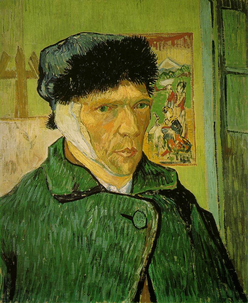
These are contemporary artists drawn from a UK magazine. I don't think either of them is recognizable but I like how the two drawings complement each other.
Added 23/4: These are the "originals" in the top drawing clockwise from top left:
http://www.ibiblio.org/wm/paint/auth/gogh/self/gogh.bandaged-ear.jpg
http://arthistory.about.com/od/from_exhibitions/ig/frida_kahlo/Frida-Kahlo---Self-Portrait--1940.htm
http://en.wikipedia.org/wiki/File:Egon_Schiele_079.jpg
http://www.codart.nl/news/89/
http://www.artquotes.net/masters/picasso/pablo_selfport1907.htm
http://en.wikipedia.org/wiki/File:Henri_Rousseau_-_Self-portrait_of_the_Artist_with_a_Lamp.jpg
http://www.nga.gov/education/classroom/self_portraits/act_warhol.shtm
http://www.museum-reproductions.com/cgi-bin/modern.pl?fid=1039954407&cgifunction=form
http://arthistory.about.com/od/from_exhibitions/ig/frida_kahlo/Frida-Kahlo---Self-Portrait--1940.htm
http://en.wikipedia.org/wiki/File:Egon_Schiele_079.jpg

http://www.codart.nl/news/89/
http://www.artquotes.net/masters/picasso/pablo_selfport1907.htm
http://en.wikipedia.org/wiki/File:Henri_Rousseau_-_Self-portrait_of_the_Artist_with_a_Lamp.jpg

http://www.nga.gov/education/classroom/self_portraits/act_warhol.shtm
http://www.museum-reproductions.com/cgi-bin/modern.pl?fid=1039954407&cgifunction=form
Sunday, April 11, 2010
Dream on

Pink Poui, acrylic and oil pastel, 9 x 12", March 2010
Last night I dreamt that I had a show at a restaurant which I had never been in before. I can't identify the place though I might be able to draw it, it was L-shaped with a side room. Neither can I remember ever meeting the gallery owner who was in her forties and blonde. At the end, as everyone was leaving, I asked her how we did and she said everything sold out!!! And then I woke up.
Tuesday, October 20, 2009
Level best
It might sound silly but one of the things I really like in drawings and paintings is when a level surface looks level. By this I mean, for example, that because of good drawing, a drawn or painted tabletop can be seen to be level. The edges might be slanted because of perspective but we as ordinary viewers know if it's "right". This preference goes against the grain of Modernism which delighted in throwing conventional perspective out the window and which teems with "tipped up" tabletops and other such surfaces. I like these too but don't feel authentic doing it myself and besides Modernism is long gone.

I sometimes use a little test of my own to figure out if something in a drawing is level. For instance, take the chair seat in Vermeer's "Woman Reading a Letter", and try this to check if it's really level: imagine placing a marble in the centre of the seat and then feel it with your body. Will the marble stay put or will it roll off?
The thing about tipped-up tabletops in Modernism is interesting for another reason. The trend developed from a belief that Cézanne's tipped up still life paintings were a manifestation of the use of multiple viewpoints and were therefore a precursor to Cubism. In previous posts I have ventured some evidence against this view. I'm now reading a book about Cézanne's landscapes that tends to question some of the 20th century art theory that was built on the tipped-up assumptions. Very interesting indeed, more in another post.
Friday, August 21, 2009
Thumbnails 2
 Click to enlarge
I've been thinking about Charles Jencks and his land forms and designs, such as this one in Scotland in the Garden of Cosmic Speculation, a wonder of the world which is open only one day in the year. Nothing to do with golf.
Wednesday, August 19, 2009
Twiddling thumbnails
 Click to enlarge
Sunday, May 24, 2009
What I like about Rubens
 This self portrait by Rubens draws me back again and again, for the drawing rather than the painting. In this case by "drawing" I mean the proportions and the solid sense of three-dimensional form. The bulk of the body is exactly right, as shown by the left hand in its placement and size, and the right hand, and the placement and size of these light areas against the dark robes. Together with the exact right distance from the head, these "facts" tell you all you need to know. It is masterful, it is magnificent, and I never get tired of looking at it. The bulk and the rightness give me an aesthetic buzz the way a sequence of chords gives pleasure in music. I suppose this makes me an art nerd.
This is a broad definition of drawing. Drawing is often interpreted much more narrowly, being limited to "lines" or the "shading" (a word that makes me cringe). I think of drawing as everything except the colour, but in actual fact I don't make much of a distinction between drawing and painting at all, and in things like portraits it's mostly about the drawing, whether with paint and brush or by other means.
As an aside, the expression "out of drawing" means that a drawing is off in some way, usually proportions or foreshortening, similar to what "out of tune" means in music. When a figure drawing or portrait is out of drawing, it makes the person look deformed, it may be ever so slightly, for instance the gaze of the two eyes. If you have to wonder it is probably wrong. The sad thing is that the artist is often unable to see it, such is the nature of the artist's ego.
In figurative painting the drawing shows, it can't hide. But Rubens had no need to hide his drawing, he was one of the all-time great draughtsmen. For proof, check out Daniel in the Lion's Den. All those heads and paws and hindquarters and jaws at every angle and in every variety of foreshortening imaginable -- he makes it look easy but it sure is not. I could draw a lion in the zoo for years and years and not get one paw down as well as Rubens has got eight whole lions in one painting.

He may have had an ability to see and rotate three-dimensional forms in his head the way some computer programs can create rotating 3D models. It's possible, if one has the gift plus training and practice.
A lot of drawing is just getting things in the right place, but it is very hard and goes wrong as often as not. So celebrations are in order when it does go right.
A great Rubens website
A great Rubens website
Sunday, April 12, 2009
How Rembrandt drew Jan Six's bridge
 Rembrandt, Six's Bridge, 1645, etching, 12.9 cm x 22.4 cm
 (about 5 x 8"), Rijksmuseum
This is one of my favourite Rembrandt drawings, who knows why? While looking it up today I stumbled on this account of how it came to be made:
"The love of his art caused him to be always provided with the materials for drawing and etching, so that we have these transcripts of nature fresh from the fountain head. We know this from an anecdote mentioned by Daulby. In describing the etching of "Six's Bridge," in his catalogue, he says, "This plate was produced by an incident which deserves to be related. Rembrandt lived in great intimacy with the Burgomaster Six, and was frequently at his country seat. One day, when they were there together, the servant came to acquaint them that dinner was ready, but as they were sitting down to table, they perceived that mustard was wanting. The Burgomaster immediately ordered his servant to go into the village to buy some. Rembrandt, who knew the sluggishness of the Dutch servants, and when they answer austons (a-coming) they are half an hour before they appear, offered the Burgomaster a wager that he would etch a plate before his man returned with the mustard. Six accepted the wager, and Rembrandt, who had always plates at hand ready varnished, immediately took one up, and etched upon it the landscape which appeared from the window of the parlour in which they were sitting. The plate was finished before the servant returned, and Rembrandt won his wager. The etching is slight, but it is a wonderful performance, considering the circumstance that produced it." It is not wonderful on account of the rapidity with which it was done, but the genius and science that pervade every touch, not only in the general arrangement, but in the judicious management of the smallest darks; they are all in the most effective situations. When the plate was bit in, the name was left out; it was afterwards added with the dry point; also a little shading was given to the hat of one of the figures on the bridge, which in the rare state is white."
From Rembrandt and His Works by John Burnet FRS, London, MDCCCXLIX. (1849?) -- but really from the Project Gutenberg ebook of the above book, http://www.gutenberg.org/files/22690/22690-h/22690-h.htm
And to think, it was 200 years before Impressionism.
Tuesday, January 6, 2009
Two kinds of sketchbooks

Looking through my sketchbook for something to post, I found this pencil drawing of Joseph Beuys's coyote from I like America, America Likes Me (video), done many months ago, approx A4.
These days my sketchbooks look more like the one below, a combination sketchbook/journal/logbook. with things stuck in at will and still evolving.


Subscribe to:
Posts (Atom)