Tuesday, April 3, 2007
Dear Brutus
I've heard that J. M. Barrie comes out of copyright later this year, having died in June 1937. Best known (or only known) for Peter Pan, he was a highly successful dramatist in the first three decades of the 20th century, authoring dozens of popular grown-up plays. He's been accused of sentimentality, justly at times, but he was also a fine and compassionate observer of human nature, and his gentle wit and humour were legendary in his day. My favourite play, Dear Brutus, is (amazingly) available for download at Project Gutenberg -- http://www.gutenberg.org/etext/4021.


Sunday, March 25, 2007

Thursday, March 15, 2007
Daumier's young artist
 Honoré Daumier (French, 1808 -- 1879), after 1860, oil on canvas,
41 × 33 cm. National Gallery of Art, washington DC
Daumier is one of my favourite artists. I love his acute observation and his humour, and find endless pleasure in his drawings and lithographs, as the French public did during his lifetime. His ability to make recognisable and pointed caricatures of public figures got him thrown into jail, more than once I believe, but he continued as soon as he got out.
This piece is one of his rare paintings. It shows a young artist asking advice of an older one. I love how Daumier has managed to make the youth so callow, and how he has created a relationship of deference vs experience between the two men with a minimum of means. And I also love the way the feet of both figures are flat on the ground.
Image from Wikimedia
More Daumier images from Wikimedia
This piece is one of his rare paintings. It shows a young artist asking advice of an older one. I love how Daumier has managed to make the youth so callow, and how he has created a relationship of deference vs experience between the two men with a minimum of means. And I also love the way the feet of both figures are flat on the ground.
Image from Wikimedia
More Daumier images from Wikimedia
Saturday, March 10, 2007
Klee on good pictures
"I want to find out whether or not I'm looking at a good picture and just what is good about this particular work. I don't want to examine the common feature of a series of works or the difference between two series of works -- no such pursuit of history for me -- but to consider the individual act in itself, and were it only a single work that had the luck to become good, as recently happened with two or three of my 'paintings.'
For the fact of my not painting good pictures with a certain measure of regularity results precisely from my imperfect knowledge of what makes a good individual work."
Paul Klee
.
Monday, February 19, 2007
Untitled
 Untitled, acrylic on panel, 14 x 10" approx, 2006
I decided to post two images today because I'm expecting to be busy for the next few weeks. The bottom of this one is cut off, it didn't quite fit on the scanner. It's based on a drawing of a heron and a gull on an estuary in West Cork, Ireland, and except for the birds it's imaginary. In fact it was done before my last show but it was so different from the rest of that work that I kept it back, and now it's all on its own, a strange and lonesome little piece. Maybe I'll do another to keep it company.

Saturday, February 10, 2007
Sketch for an interior
 On a letter size page, coloured pencils.
Something new is better than nothing?
Thursday, February 1, 2007
Vendor, Port of Spain
 Vendor, Port of Spain
Tuesday, January 23, 2007

Saturday, January 20, 2007

Monday, January 15, 2007
Men at work and art teaching

This photo of an electric company worker and the previous two photos (one of a car repair shop and one of lifeguards) have a common theme of "Men at work", which is not entirely accidental. The theme reminds me of a secondary school art exam more than 40 years ago. Students were required to make a painting, on terrible paper and with terrible paints, on this very theme. I don’t believe any of the students had ever done a figure drawing from life. Whatever art teaching we had may have done no harm but I don’t think it did much good either. In fact I don’t remember being taught anything at all, though I could be wrong on that point. In my memory, art classes were for daubing around with no very clear purpose, though I remember liking art a good deal. So how would a class of 16-year-olds, with no knowledge, no facts, no experience, have tackled the theme of "Men at work" out of their heads? I know my own effort was pathetic. I did a variation of a picture that the teacher had praised in the past, containing a dramatic rearing horse. The trouble was, its relation to the theme of "Men at work" was tenuous at best.
.
Wednesday, January 10, 2007
Denis Dutton on Kitsch
In The Dictionary of Art, Macmillan, London, 1998:
.
Read the whole articleKitsch (from German, pretentious trash, kitschen, to smear, verkitschen, to make cheaply, to cheapen).
“Kitsch” has sometimes been used (for example, by Harold Rosenberg) to refer to virtually any form of popular art or entertainment, especially when sentimental. But though much popular art is cheap and crude, it is at least direct and unpretentious. On the other hand, a persistent theme in the history of the usage of “kitsch,” going back to the word’s mid-European origins, is pretentiousness, especially in reference to objects that ape whatever is conventionally viewed as high art. As Arnold Hauser has remarked, kitsch differs from merely popular forms in its insistence on being taken seriously as art. Kitsch can thus be defined as a kind of pseudo-art which has an essential attribute of borrowing or parasitism, and whose essential function is to flatter, soothe, and reassure its viewer and consumer.
.
Tuesday, January 9, 2007

Wednesday, January 3, 2007

Monday, January 1, 2007
More views on using photographs
Another view on using photos, with a great set of comments, on another blog: http://www.artandperception.com/2006/12/using-photographs-for-painting.html
Thursday, December 21, 2006
Cracked Egg by Jeff Koons
http://www.gagosian.com/exhibitions/davies-street-2006-10-jeff-koons/
(Added 13 Jan 2007) Check out this amazing creation while it's still available on the net.
(Added 13 Jan 2007) Check out this amazing creation while it's still available on the net.
Wednesday, December 20, 2006
Cezanne: That Pedestal
 This drawing happened the wrong way round. I was looking at a Cézanne still life and scribbled this diagram of the composition onto the back of an envelope. A few weeks later the diagram, lying on the desk, floated into consciousness. And all of a sudden, there it was: the reason for Cézanne‘s off-centre pedestal. It had to be off-centre or else he’d have had to repaint the fruit entirely, moving the main weight to the right. Instead he moved the pedestal to the left, under the centre of gravity. This was a kind of eureka moment for me, and I pass it on as a Christmas present to my (rare and much appreciated) readers.
Much has been written about Cézanne‘s composition, which somehow works in spite of oddities like this. Or rather, this way of looking at it helps to explain why his composition works so well. In this case, I'm proposing that the off-centre pedestal was not random or arbitrary, and that it was not a vague device “to strengthen the composition”; and further, that Cézanne was not consciously inventing a revolutionary school of painting. Rather, I'm saying that he moved the pedestal because everything on earth is subject to the law of gravity, and it suited his pictorial purpose better to move the pedestal rather than to move the fruit.
This completes the thought about Cézanne‘s pedestal which was originally mentioned in a discussion about the artist's intention.
(Edited Jan 10, 2007 -- rephrased and cut but the meaning not changed)
.
Friday, December 15, 2006

Monday, December 4, 2006
Oxford online short courses
Oxford University's Continuing Education department's website has published a discussion about Jackson Pollock in which yours truly took part during an online art history course last year. Log in as a guest to read the discussion.
More info about Oxford's online art history courses here. They also offer short courses (for credit) in Philosophy, Literature, and History of Architecture.
More info about Oxford's online art history courses here. They also offer short courses (for credit) in Philosophy, Literature, and History of Architecture.
Thursday, November 30, 2006

Saturday, November 25, 2006

Saturday, November 18, 2006
A drawing of feet
Another drawing of feet, by me; Conte crayon on brown paper, last week, from life.


Friday, November 10, 2006
Cezanne 2: Multiple viewpoints and tablecloth
In Cézanne’s famous Still lIfe with Apples and Oranges, it has been claimed that the table is being shown from two viewpoints, and in fact the lower left part of the picture is very confusing. One oft-quoted theory is that the leg of the table is resting on a sofa. What is going on?
Specific, answerable questions arise:
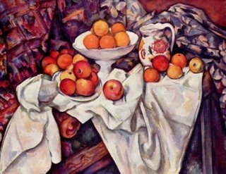
1) The table itself, is it parallel to the viewer (horizontal) or is it at an angle going into the picture, or both?
2) That round yellowish thing in the lower left quadrant, is it a drawer knob? Probably not, because it’s too big. So what could it be?
After much pondering, I began to wonder if the lower left part of the painting could be explained by an additional tablecloth with a border and a big pattern. This would mean there are three different fabrics in the painting in addition to the white tablecloth: two in the background, a red and green one on the left, and a beige and green one on the right, and then, underneath the white cloth, another tablecloth with a big pattern and a border, placed on the table at an angle so that you’re seeing the border as a diagonal in the lower left of the painting.
Seen in this way, the table could be straight on to the viewer, with the proposed new tablecloth draping over the corner of the table at far right. A Google image search shows that in the majority of Cézanne’s still lifes the table is in fact horizontal ; and the renowned critic Meyer Schapiro has said that the mass of the the objects in this still life is more or less horizontal across the picture plane. But these two things alone don't prove anything. More convincing evidence could come from another quarter: As a painter of still life myself, I’m conscious of how studio props may be used by painters over and over again in different combinations, so much so that you can sometimes identify the painter by the props. So, to find supporting evidence for my hypothesis, I set out in search of another Cézanne still life with the proposed new tablecloth in it. This was the mission: to find a still life by Cézanne containing a fabric with a large pattern and a border.
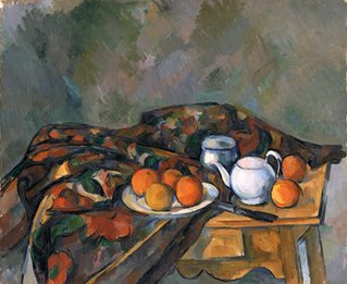 To my amazement, I actually did find one, obscure as it may be, on the website of the National Gallery of Wales. It's called Still Life with Teapot (1902-06, left), and the big pattern and border of the fabric are consistent with the proposed new cloth. The bordered edge is even draped diagonally over the table edge. The colours are not identical, but this is not significant, because the purpose of still life painting is not necessarily to copy the objects.
And as if that was not enough, earlier this year I had further confirmation that the hypothetical tablecloth really did exist in Cézanne’s studio. I came upon it, amazing as it may seem, in the Museum of Modern Art in New York: another Cézanne still life with the hypothetical cloth, called Still Life with Ginger Jar, Sugar Bowl and Oranges, 1902-06.
(Above: My blurred photo of the Moma still life)
So now I am reasonably sure that this is a valid explanation of this particular aspect of Apples and Oranges, or rather its lower left quadrant. It was a fun project, a little like detective work, and I was thrilled to come up with a plausible alternative to existing theories. But it has left me feeling sceptical about academic readings of paintings and still unconvinced about the role of multiple viewpoints in Cézanne's art; which in turn makes Cézanne's role in Cubism less clear.
(See also Cezanne 1: Multiple viewpoints and Cubism)
Specific, answerable questions arise:

1) The table itself, is it parallel to the viewer (horizontal) or is it at an angle going into the picture, or both?
2) That round yellowish thing in the lower left quadrant, is it a drawer knob? Probably not, because it’s too big. So what could it be?
After much pondering, I began to wonder if the lower left part of the painting could be explained by an additional tablecloth with a border and a big pattern. This would mean there are three different fabrics in the painting in addition to the white tablecloth: two in the background, a red and green one on the left, and a beige and green one on the right, and then, underneath the white cloth, another tablecloth with a big pattern and a border, placed on the table at an angle so that you’re seeing the border as a diagonal in the lower left of the painting.
Seen in this way, the table could be straight on to the viewer, with the proposed new tablecloth draping over the corner of the table at far right. A Google image search shows that in the majority of Cézanne’s still lifes the table is in fact horizontal ; and the renowned critic Meyer Schapiro has said that the mass of the the objects in this still life is more or less horizontal across the picture plane. But these two things alone don't prove anything. More convincing evidence could come from another quarter: As a painter of still life myself, I’m conscious of how studio props may be used by painters over and over again in different combinations, so much so that you can sometimes identify the painter by the props. So, to find supporting evidence for my hypothesis, I set out in search of another Cézanne still life with the proposed new tablecloth in it. This was the mission: to find a still life by Cézanne containing a fabric with a large pattern and a border.
 To my amazement, I actually did find one, obscure as it may be, on the website of the National Gallery of Wales. It's called Still Life with Teapot (1902-06, left), and the big pattern and border of the fabric are consistent with the proposed new cloth. The bordered edge is even draped diagonally over the table edge. The colours are not identical, but this is not significant, because the purpose of still life painting is not necessarily to copy the objects.
And as if that was not
 enough, earlier this year I had further confirmation that the hypothetical tablecloth really did exist in Cézanne’s studio. I came upon it, amazing as it may seem, in the Museum of Modern Art in New York: another Cézanne still life with the hypothetical cloth, called Still Life with Ginger Jar, Sugar Bowl and Oranges, 1902-06.
(Above: My blurred photo of the Moma still life)
So now I am reasonably sure that this is a valid explanation of this particular aspect of Apples and Oranges, or rather its lower left quadrant. It was a fun project, a little like detective work, and I was thrilled to come up with a plausible alternative to existing theories. But it has left me feeling sceptical about academic readings of paintings and still unconvinced about the role of multiple viewpoints in Cézanne's art; which in turn makes Cézanne's role in Cubism less clear.
(See also Cezanne 1: Multiple viewpoints and Cubism)
Friday, November 3, 2006
Cezanne 1: Multiple Viewpoints and Cubism
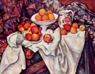
Paul Cézanne, Still Life with Apples and Oranges, 1895-1900
The consensus in the art books seems to be that Cézanne was the inspiration for Cubism. But in what way exactly? If one goes into the genesis of Cubism more deeply, to follow the trail back to Cézanne and lay it out in concrete terms, as I recently tried to do, the evidence turns out to be quite dubious. Or, one could start with Cézanne’s pictures and examine them for evidence of a connection going forward to Cubism, as I also recently tried to do. Again the evidence is dubious.
Apples and Oranges (above) is a case in point. Art historians point to it as an example of Cézanne’s supposed use of multiple viewpoints. “Multiple viewpoints” is seen as a founding principle of cubism. It’s claimed that in Apples and Oranges the table as a whole is seen from one viewpoint, while the tilted plate of apples (mid-left) is seen from another viewpoint, higher up. However, Cézanne was known to use things like wooden blocks and books to tilt objects upwards or forwards in his s
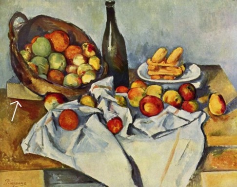 till lifes. Often the block would be hidden by a cloth, but sometimes it was visible (e.g., image at left, Still Life with Basket of Apples, 1890-94, arrow). Therefore it’s safer to assume that a tilted plate in a Cézanne still life is the result of being physically propped up rather than assuming a revolutionary change in the method of picture-making. A supporting block may be more mundane, but it’s more likely to be true.
Of course, if one now accepts the notion that the plate is physically tilted by a block placed underneath it, one might begin to wonder, why did he do that? That is another question altogether. I’d guess if one put one’s mind to it, a logical explanation would emerge, and in any case it’s not unusual for painters to use such devices in still life set-ups to get everything looking the way they want. But I do know that if the initial premise is wrong, the conclusion is likely to be wrong too, and I’m tending to feel that that is the case with the “multiple viewpoints” theory, both in Cézanne’s art and in Cubism.
Both images from Wikipedia
See also Cezanne 2: Multiple viewpoints and tablecloth
Wednesday, November 1, 2006
Precision hanging

A view of some of Judith Shaw's work at Horizons, precision-hung by Christopher Cozier. Beverly Thomas is also featured. The show opened yesterday and runs until November 11.
Monday, October 30, 2006
Leroy Clarke on the Jaye Q Show
Leroy Clarke was interviewed on the Jaye Q Show on Cable News Channel 3 (CNC3) on Monday October 30, 2006.
A few quotes from the interview:
A few quotes from the interview:
- You want to be free? – go look for a forest.
- [About Jaye Q’s show] ... it’s a moment of stillness.
- I want to be the sun, you want to be the sun, but all of us don’t make.
- It is not easy to be yourself.
- I’m getting older and probably seeing more clearly.
- People need to stop planting confusion.
- We must prepare more centres of quiet …there is too much babbling.
Saturday, October 28, 2006
Quest on CNN
I've just finished watching "Quest" on CNN, though I missed some of it because of a thunderstorm. It turned out to be an hour-long program on modern art. There was an interview with David Hockney which showed some of the pieces in the current blockbuster retrospective of his portraits. Then a conversation with Rolf Harris, then a gap for the thunder, and when I turned on the TV again Quest was in Sotheby's, covering an auction in which a Peter Doig painting went over its estimate. Great stuff!
The show repeats today at 3 p.m., and tomorrow (Sunday) at 2 a.m. and 4 p.m. (our channel 37).
The show repeats today at 3 p.m., and tomorrow (Sunday) at 2 a.m. and 4 p.m. (our channel 37).
Thursday, October 26, 2006
Drawing people from TV
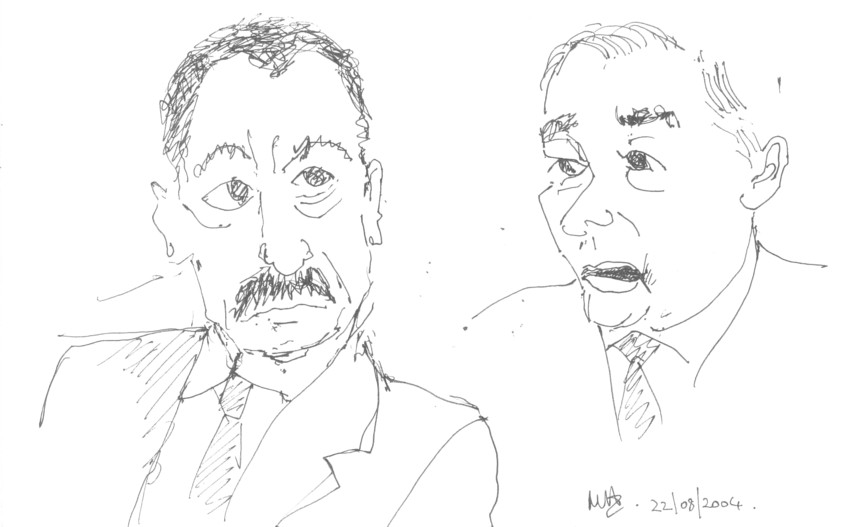
East and West
Sometimes I try to draw moving people from the TV. Not only do the people move, the camera angles move too, so an actual image may be on screen for only a second, which is not enough. This is usually the case with movies, though I didn’t realize how often the camera angles change until I tried doing drawings. On the other hand, talk shows offer better opportunities. A head may remain on screen in approximately one position for a whole minute, and chances are the camera will come back to the same person before the show is over. The drawings tend to be unfinished, naturally, which doesn't bother me. I assume, perhaps wrongly, that the viewer will fill in the gaps from imagination, such as the back of the head of the man at right.
These two men were in the same talk show but were drawn at different times. Oddly, accidentally fetching up on the same page, a kind of tension emerges between them which expresses something of the fraught historical relationship between east and west.
Friday, October 20, 2006
Grande Riviere by Peter Doig
See the actual picture in colour
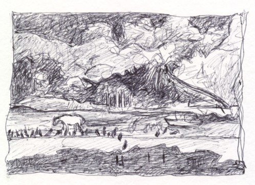
This is a scribble in ballpoint after a painting called Grande Rivière by Peter Doig. The real picture is at the National Gallery of Canada in Ottawa. Doig painted it in 2001-2002 from photographs and memory after a visit to
- the size (about 7 feet by 12 feet)
- the strange colour
- the corbeaux, common in the area, which give the picture a spooky atmosphere, clustered as they are around the pony.
Saturday, October 14, 2006
Representation
Denis Dutton in an essay called Aesthetic Universals:
"Aristotle regarded the visual and dramatic arts as naturally mimetic, in some manner representing something, whether in words, marble, or paint. He viewed the human interest in representations — pictures, drama, poetry, statues — as an innate tendency, and he was the first philosopher to attempt to argue, rather than simply assert, that this is the case: “For it is an instinct of human beings from childhood to engage in imitation (indeed, this distinguishes them from other animals: man is the most imitative of all, and it is through imitation that he develops his earliest understanding); and it is equally natural that everyone enjoys imitative objects. A common occurrence indicates this: we enjoy contemplating the most precise images of things whose actual sight is painful to us, such as forms of the vilest animals and of corpses” (Poetics 1448b). Aristotle’s frame of reference for generalizations was specific to ancient Greek culture, but it is impossible to dispute the claim that children everywhere play in imitation of their elders, each other, even animals and machines, and that such imaginative imitation appears to be a necessary, or at least normal, component in the enculturation of individuals. The other side of Aristotle’s mimetic naturalism holds that human beings everywhere enjoy to see and experience imitations, whether pictures, carvings, fictional narrative, or play-acting. For Aristotle, the child’s fascination with a doll’s house with its tiny kitchen and table settings is not to be reduced to a desire for adult power, but in its imitative play is based in the instinctive delight in representation as such. This pleasure, he argues, can be independent of the nature of the subject represented: that is why the sight of a large, black fly walking over ripe fruit might disgust us in the kitchen, but can be a source of delight in a meticulously painted seventeenth-century Dutch still-life."See the whole essay.
Wednesday, October 11, 2006

Subscribe to:
Posts (Atom)