Back in 2011 I made a short video about gesture drawing and uploaded it to YouTube. I had done it on a Mac and soon afterwards my Mac was stolen. A little while after that I realized the video needed editing but was unable to make the edits in Windows XP, so I withdrew it from YouTube until I could fix it. Only now, four years later, have I finally been able to edit it with MovieMaker in Windows 7. The edits were mainly cuts, and I added a few bits of explanatory text. So here it is belatedly. Hope someone gets something useful from it!
Showing posts with label art. Show all posts
Showing posts with label art. Show all posts
Thursday, April 30, 2015


Sunday, June 16, 2013
Some recent work
 |
| Mary Adam, Apple with leaves, acrylic on stretched canvas, 8 x 8" |
 | ||
Mary Adam, Blue flowers, acrylic on stretched canvas, 8 x 8"
|


Monday, April 6, 2009
Recycling cardboard

Small pieces of cardboard can be used to paint on and I rescue them whenever I can. I've primed these with a thin coat of glue (white glue mixed 1:1 with water) and now they can be used for any medium including oils since the priming seals the surface and prevents paint from being absorbed into the cardboard. The glue looks whitish and semi-opaque when wet but is transparent when dry. The one on the left is bowing with the wet glue but the card is thin and pliable and can be mounted on something else if the work is worth keeping. If preferred the priming can be done with acrylic gesso instead which gives an opaque white ground.
I like having a few of these around ready-primed. Being cheap, not to mention virtually free, one doesn't feel inhibited or afraid of wasting materials when using them. These are ordinary grey cardboard. The brown corrugated cardboard can be used too but it isn't quite as good.
Sunday, February 8, 2009
Before and after
Big studio clean-up this past week. Here are the promised before-and-after pictures:

 Can't think of anything else to say!

 Can't think of anything else to say!
Sunday, August 24, 2008
What about gouache?
Gouache is my favourite medium for quick colour studies. The main advantages are speed and opacity. It takes just minutes to get going, and unlike watercolours, the paints are opaque and can be painted onto any old paper, white or tinted or ordinary brown, going straight to lights and darks and middle tones without fuss or bother.
 Good quality gouache paints go on smoothly and spread easily and are a pleasure to use. Only a small amount of each colour is needed on the palette. These shown here have good coverage and tinting strength -- a little goes a long way.
The paints are not waterproof which is both a plus and a minus. Any spills or splashes are easily cleaned up, unlike oil and acrylic, which need more advance preparation. Even if the paint dries accidentally in a brush it can be washed out. Also, only one brush is needed. The sable brush shown here is the only brush I've used for gouache for several years now.

The disadvantage of not being waterproof is that dried paint already on the paper may dissolve when overpainting. This doesn't bother me, I just accept the new mix or paint more thickly, depending on what I'm aiming for.
The gouache colour studies shown below, Road 1 and Road 2, both about 8.5 x 11", were each done in about 30 minutes. They are only studies and I confess I don't think of my own gouaches as finished pieces, they're just steps on the way to something else. Many painters take gouache to a high level of finish.
So, in a nutshell, for me gouache is a great way to try out ideas and to generate new ideas, because one thing does have a way of leading to another.


.
 Good quality gouache paints go on smoothly and spread easily and are a pleasure to use. Only a small amount of each colour is needed on the palette. These shown here have good coverage and tinting strength -- a little goes a long way.
The paints are not waterproof which is both a plus and a minus. Any spills or splashes are easily cleaned up, unlike oil and acrylic, which need more advance preparation. Even if the paint dries accidentally in a brush it can be washed out. Also, only one brush is needed. The sable brush shown here is the only brush I've used for gouache for several years now.

The disadvantage of not being waterproof is that dried paint already on the paper may dissolve when overpainting. This doesn't bother me, I just accept the new mix or paint more thickly, depending on what I'm aiming for.
The gouache colour studies shown below, Road 1 and Road 2, both about 8.5 x 11", were each done in about 30 minutes. They are only studies and I confess I don't think of my own gouaches as finished pieces, they're just steps on the way to something else. Many painters take gouache to a high level of finish.
So, in a nutshell, for me gouache is a great way to try out ideas and to generate new ideas, because one thing does have a way of leading to another.


.
Wednesday, August 20, 2008
Writers on Artists
Writers on Artists
In association with Modern Painters
DK Publishing, Inc. (2001)
Billed as "A collection of great writing on art by some of the world's leading novelists, poets, critics, and artists from the pages of Modern Painters magazine. Foreword by A.S. Byatt"
I got this book from the library last week and it's great. It consists of reviews and interviews from eighteen years of Modern Painters magazine. I've read only a few so far, dipping here and there into some that jumped out (e.g. David Hockney on Picasso, Matthew Collings on Jeff Koons), but now I've started over at the beginning and am reading it all the way through.
Many of the articles are interviews and this makes the book fresh and up to date and compelling. For instance, Matthew Collings asks Jeff Koons whether he really means what he says, and goes on, "It's like a fairground spiel, isn't it? -- the 'Jeff Koons Show'? Koons says, "Absolutely. This is 'Jeff Koons Entertainment.' I believe in art as a communicative device that's part of the entertainment world. It participates in 'showtime.' It just draws a slightly different audience than other entertainment vehicles."
Later in the interview MC asks, "What about more old fashioned artists who just want to paint Nature and the model in the studio and so forth?" JK says, "Well, if they weren't allowed to do that, then that's the thing we'd all want to start doing . . . there has to be this conservative aspect of course. If it was banned then pretty soon radical artists would be moving into that void. Somebody's got to maintain it, otherwise we'd all be back in there fighting for Nature again."

Each article consists of about 2,000 to 3,000 words, and is generously illustrated. The pictures have all the necessary information -- date, medium, size in inches and cm, and location.
The book contains 40 of these articles in all, making it a substantial and satisfying read. Here's a few selected writers/artists from the list which is too long to type in full: Howard Jacobson on Andy Warhol, Germaine Greer on Paula Rego, Jed Perl on Henri Matisse, Will Self on Damien Hirst, Julian Barnes on Edgar Degas, David Bowie on Tracey Emin, A.S. Byatt on Patrick Heron, Jules Olitski on Himself, Seamus Heaney on Barrie Cooke, and many more. Enjoy!
.
Sunday, March 2, 2008
Art and Philosophy
This week's library book is Key Writers on Art: The Twentieth Century.
The book consists of encyclopedia-type articles in alphabetical order, starting with Theodor Adorno and ending with Wilhelm Worringer. Each article describes and explains briefly the person's ideas, thinking and major contributions to the field and is about one to two thousand words long. Each article is written by an expert on the person's life and work and ends with a brief biography and bibliography. There are no illustrations.
I read it all the way through. The "key writers" are art historians, art critics, cultural theorists, and (the largest proportion) philosophers. The list includes Clement Greenberg, Meyer Schapiro, Roger Fry and Clive Bell, Martin Heidegger, Jacques Derrida, John Dewey, Sigmund Freud, Julia Kristeva, Griselda Pollock, and so on -- all names that ring some bell or press some button; and many more, famous or less well-known, for a total of forty-nine.
The book turned out to be about as far as I want to go with the philosophy of art (and aesthetics, of course, which falls in the field of philosophy). It was a good overview of the field however and I'm glad I read it.
To me, the anthologies of writings by actual practicing artists covering different periods are more valuable to the painter or the art student -- the Renaissance to the 19th century edited by E.G. Holt; the first half of the 20th century edited by Herschel B. Chipp; and Post WW2 to the mid 1990s, edited by Kristine Stiles and Peter Selz ("Theories and Documents of Contemporary Art").
Key Writers on Art: The Twentieth Century, edited by Chris Murray, published by Routledge, 2003; 314 pages with index.


Sunday, November 4, 2007

"Talking Through the Wire Fence--the evacuees talk with visitors who were unable to gain admittance." by Chiura Obata, July 1942. Sumi, 11" x 15 ½"
"In the midst of this desert, we artists' job is not to discuss the war, nor waste time by gossiping and foment uneasiness among our residents. But our utmost effort should be given to develop culture and soften the people's hearts which somehow seem to have a tendency to harden under the circumstances.Matsusaburo Hibi, in Beyond Words: Images from America's Concentration Camps. From an exhibition at the Smithsonian Institution
Existence of an art schools is now more necessary and essential than ever before, especially in such a place as Topaz, where it is like a lone beautiful flower with a sweet fragrance in bloom....It is not for the mere existence of teaching technique, but also to foster infinite inspirations, emotions, and peaceful thoughts in the people, young and old."
Saturday, May 5, 2007
Cubism essay, update
I have now put the Cubism essay of the previous post into html which is much easier to access, approx. 50K vs. 1.6 MB, and I've removed the PDF file. The html file is at http://maryadamart.com/Cubism_The_Big_Picture.htm
Friday, May 4, 2007
Cubism, the Big Picture
I've put a PDF file on my website called "Cubism: The Big Picture", here. It's an essay I wrote last year on the origins of Cubism and its logic and rationale, focussing mainly on Picasso. It's just over 2000 words, about 10 pages. I will do it in html eventually, don't have time right now. The conclusion I came to was not what I've seen in standard sources such as Gombrich. Unfortunately I had to take out most of the images and put links instead. Comments would be great... and please do email me at folio@wow.net if the file gives any trouble to download or to open.
Monday, October 30, 2006
Leroy Clarke on the Jaye Q Show
Leroy Clarke was interviewed on the Jaye Q Show on Cable News Channel 3 (CNC3) on Monday October 30, 2006.
A few quotes from the interview:
A few quotes from the interview:
- You want to be free? – go look for a forest.
- [About Jaye Q’s show] ... it’s a moment of stillness.
- I want to be the sun, you want to be the sun, but all of us don’t make.
- It is not easy to be yourself.
- I’m getting older and probably seeing more clearly.
- People need to stop planting confusion.
- We must prepare more centres of quiet …there is too much babbling.
Friday, September 22, 2006
Is it round or is it flat?
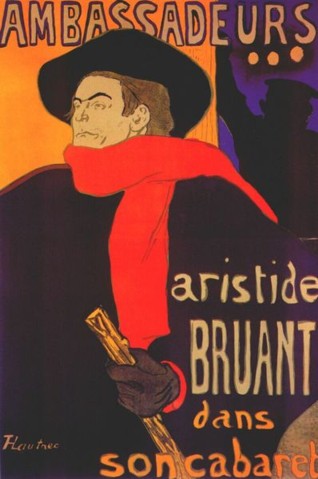
Toulouse Lautrec’s posters stand out even today for their modern look, with their broad flat areas of colour. The “flatness” of modern art became a big deal around the middle of the twentieth century, promoted by the influential American critic Clement Greenberg. But the overall effect of Lautrec’s work is not flat at all. On the contrary, he creates a wonderful impression of three-dimensional form, and he does it solely with line, not with darker tone (or “shading”, as it’s often called).

Monday, September 18, 2006
Galvanize -- Banana monologues

Galvanize: A poster/intervention by Sabrina Charran on a wall in Keate Street, photographed from Memorial Park
Sunday, September 3, 2006
David's drawing of Marie Antoinette
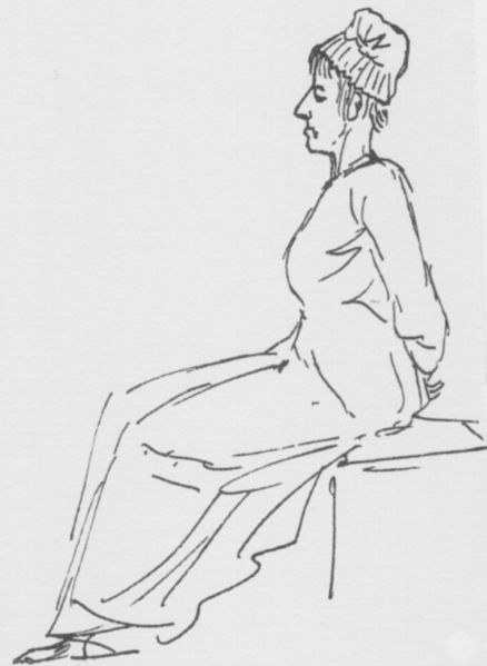 Marie Antoinette on her way to the guillotine, October 16 1793, by Jacques Louis David (pen and ink, 15 x 10 cm, approx 6 x 4 inches, Louvre, Paris).
I think knowing the context affects how one interprets the drawing. Yet it’s not only an illustration, it’s an infinitely expressive drawing, oddly sympathetic and universal. And too, in my view it does something that photographs can't do, though I can't put into words what it is.
"She wrote her final letter known as her 'Testament', to her sister-in-law Elisabeth. She expressed her love for her friends and family and begged that her children would not seek to avenge her murder."Image and quote from http://en.wikipedia.org/wiki/Marie_Antoinette
P.S., added September 17, 2006: The reason I put that quote in was because before stumbling on this (famous) drawing, all I knew about Marie Antoinette was, "Let them eat cake". The drawing however showed such an intriguing personality that I went looking up more about her. It turns out that (as no doubt everyone except me knows) she's a highly controversial figure among historians, and very likely was not as bad as she's been painted. In such cases the picture gets murkier with the passage of time until one doesn't know what to believe. But facts are facts, and her last letter was (I assume) a documented fact; and to me, her request that her children not seek revenge shows that she was not all bad.
And the Web Gallery of Art has this to say: "Marie Antoinette was only thirty-seven, but a year's imprisonment had made her look much older. Her hair was prematurely grey and, robbed of her false teeth, wig and corset and seated on a wooden plank on the back of a tumbrel, she looked a pathetic figure. After a brief loss of composure she met her end with great fortitude, dignity and calm, even apologizing to the executioner for having accidentally stepped on his foot."
Thursday, August 24, 2006
A scribble drawing
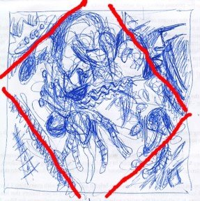
The blog is for random drawings and other images, based on the idea that drawing is a way of thinking. To start it off, this scribbled analysis of Fugue by Kandinsky brought out a possible underlying tilted grid (red lines).
Subscribe to:
Posts (Atom)