Showing posts with label painting. Show all posts

Monday, December 30, 2013

Mangoes and stats

Mangoes, acrylic on canvas by Mary Adam (c) Mary Adam
Mangoes, acrylic on canvas, (c) Mary Adam

Mangoes was painted between May and September this year. 


End of year figures 2013

No proper statistics  since I didn't do an end of year post this time last year and am no longer using a hit counter except for Blogger's own minimal Stats.

Subscribers, email and RSS:  115 (about the same as 2011) (from Feedburner)
Posts in 2013:  35, up from 16 in 2012 (34 in 2011).
Page views -- the total is now 99,205 and is averaging about 2400 2200 page views/month.


Monday, September 30, 2013

Brendan Cass, one in 4.4 million

Journal page on Brendan Cass
There must be millions of living artists in the world. In fact I just looked it up and it turns out there are 4.4 million active artists in the USA alone, of which 3.2 million are recreational artists, 600,000 are professional artists and 122,000 are art-degree-seeking college students (http://www.artistmentorsonline.com/?tag=how-many-artists-are-there).

The figures are mind-blowing, or maybe disconcerting, but that's not what this post is about. In this crowded field, how does one choose artists to look at or to focus on, those who can answer questions one might have or give one ideas? Mostly, for me anyway, it's luck or serendipity. Usually wherever I land up turns out to be instructive or inspiring in some way or other. In this way, while reading recently about Donald Baechler, he mentioned Brendan Cass (b. 1974, American) as a young artist to watch. So I followed that lead and it proved to be a good one to share. The image at left shows some of Brendan Cass's paintings, and below that some journal notes from a video interview at a show in Lars Bohman Gallery in ?Stockholm, Nov-Dec 2009.

I'm not sure if this artist has hit the big time yet but he's certainly heading that way. The paintings are large to very large (e.g. 6' x 12') and are loosely based on photos. They seem very free and spontaneous but he takes a long time over them. He uses store-bought small canvases to try out colour combinations. Often he works from the photo first and goes to visit the place/country afterwards, and he has a particular liking for Northern countries and winter landscapes. He uses bright, even fluorescent colours, saying he likes to load a painting with as many colours as possible. The paintings are very gestural and loaded with texture and yet they don't look messy. They remind me of Peter Doig in their evocation of mood and space. He has done at least one of Ireland (Glendalough) which I would love to see but haven't been able to find it.

In a video of a studio visit filmed in 2012 by New Art TV, Cass's studio is an old railway station on a disused train line near a river in Connecticut  -- idyllic really. Here it is ...


Monday, September 2, 2013

Artist at work


Contemporary abstract artist Martin Wohlwend of Liechtenstein working in his studio. That's oil stick he's using. He does sometimes use colour but not in this video, it's an all-black work. I found it fascinating to watch.

Sunday, June 30, 2013

Sean Scully's monumental moments

Sean Scully has studios in Germany, New York, London and Barcelona, at least. After an intense period of painting he feels nervous, strung out and emptied. He goes walking in the mountains to replenish. (1)

“Art is a little like the donkey and the carrot and the artist never reaches the carrot .. haha .. you never get to nirvana ... it’s not possible because your concept, your ambition, is always greater than what you’re able to achieve ...
  [...] It should be something that is happening all at once ... that’s inhabiting you and that you are doing ... and you have one way or another managed to get yourself into that space ... and there’s an angel on your shoulder. That’s how you should make art. If you’re plotting art ... and trying to make something to get something, you’re not in a state of creative innocence – you’re not making art, it’s something else.” (2).

These are snippets from two terrific videos I watched over the last few days. The first is a conversation in 2004 in front of a studio audience at the Tate, while the second was made in 2011 and includes some footage of Scully at work as well as glimpses of the spectacular landscape around his studio in Germany. 

He is evidently generous with his time as there are numerous published interviews to be found around the internet as well. And he rarely repeats himself, which means there’s always something new to discover. I get the feeling he doesn't think much of artists who delegate the actual painting:  
“I’m not a pimp artist. I make all my work myself.” (1) 
He mentions that when many oil paintings are drying together, the air can become toxic and he needs to leave for a while.

More quotes:
“We like to think we are what we are. But we are tremendously defined by context. We’re in a relationship with the world.” (1)
 “You learn a lot when someone writes on your work” (referring to critical reviews). 
 “A painting is a compression where everything is made, thought, felt at the same time – a monumental moment.” (1)

And to wind up, an authentic statement of his aim: “The enterprise [painting] has a sense of the absurd about it. I don’t think about risk. I’m trying to make something that moves me even if it’s like something else already made.” (c. 45 minutes in the Tate video).

The links:


Sunday, June 16, 2013

Some recent work


For the past year or so I've been working on several projects at once. I think of the projects as lines of enquiry, or planks, and they're all related though seemingly very different visually. Basically I'm exploring the mysterious world of plants through different media -- drawing, painting, printmaking, and collage. Here is some of the work:

Mary Adam, Apple with leaves, acrylic on stretched canvas, 8 x 8"
Mary Adam, Blue flowers, acrylic on stretched canvas, 8 x 8"


Mary Adam, Mind and body, collage


Mary Adam, Heart of the matter, coloured pencil 


Mary Adam, Plant Life 1, mixed printmaking techniques
The second-to-last one is based on a drawing of an Acalypha species from my series of wild flower drawings done in the 80s. A previous post on the series might help to explain some of the things going on here ...


Thursday, November 29, 2012

Time taken to do the OCA degree

Right click and "open in new window" to enlarge
Belatedly, this table shows the total time taken to do the OCA Painting degree: 5 years and 8 months from receiving the first course to finishing the last one, excluding assessment. I saved almost two years by doing two courses concurrently in level 1 and level 2. The letter with the final result arrived in the post on April 12, 2011, exactly six years to the day after starting.

Related posts: 

http://mary-adam.blogspot.com/2009/09/time-taken-to-do-oca-courses.html
http://mary-adam.blogspot.com/2010/01/more-figures-stats.html
http://mary-adam.blogspot.com/2010/12/landmark.html

Tuesday, January 26, 2010

Picasso's landscapes


Picasso isn't well known for his landscapes so I was surprised recently to find them a treasure trove for the art student. A striking feature (to me, anyway) is that, despite his reputation as an "abstract" artist, his landscapes have a definite sense of place, more so than many photorealist-type landscape paintings. If you're a Picasso fan this isn't surprising because as we know he aimed to intensify experience by distortion, emphasis, even caricature. So the Mediterranean landscape above is vintage Picasso and also intensely Mediterranean, from the rooftops shimmering in the sun and the deep blue sea down to the triangles of terraced garden and the potted plant on the wall. Another one is of a village called Mougins where he lived for the last fifteen years of his life. It shows a mountain landscape with lakes and tilled fields, with the muted colour conveying a sense of awe at the majesty of nature.

This is something I'd like to be better at, expressing a sense of place in landscape painting.

It's interesting too that these pictures show Picasso's mastery of and interest in depth, debunking the received wisdom that he was a flat painter (Greenberg I think, and others, can find a ref. if anyone wants it).

[Countdown: Empty pages remaining in main sketchbook = 37]

Sunday, May 24, 2009

What I like about Rubens

This self portrait by Rubens draws me back again and again, for the drawing rather than the painting. In this case by "drawing" I mean the proportions and the solid sense of three-dimensional form. The bulk of the body is exactly right, as shown by the left hand in its placement and size, and the right hand, and the placement and size of these light areas against the dark robes. Together with the exact right distance from the head, these "facts" tell you all you need to know. It is masterful, it is magnificent, and I never get tired of looking at it. The bulk and the rightness give me an aesthetic buzz the way a sequence of chords gives pleasure in music. I suppose this makes me an art nerd.

This is a broad definition of drawing. Drawing is often interpreted much more narrowly, being limited to "lines" or the "shading" (a word that makes me cringe). I think of drawing as everything except the colour, but in actual fact I don't make much of a distinction between drawing and painting at all, and in things like portraits it's mostly about the drawing, whether with paint and brush or by other means.

As an aside, the expression "out of drawing" means that a drawing is off in some way, usually proportions or foreshortening, similar to what "out of tune" means in music. When a figure drawing or portrait is out of drawing, it makes the person look deformed, it may be ever so slightly, for instance the gaze of the two eyes. If you have to wonder it is probably wrong. The sad thing is that the artist is often unable to see it, such is the nature of the artist's ego.

In figurative painting the drawing shows, it can't hide. But Rubens had no need to hide his drawing, he was one of the all-time great draughtsmen. For proof, check out Daniel in the Lion's Den. All those heads and paws and hindquarters and jaws at every angle and in every variety of foreshortening imaginable -- he makes it look easy but it sure is not. I could draw a lion in the zoo for years and years and not get one paw down as well as Rubens has got eight whole lions in one painting.


He may have had an ability to see and rotate three-dimensional forms in his head the way some computer programs can create rotating 3D models. It's possible, if one has the gift plus training and practice. 

A lot of drawing is just getting things in the right place, but it is very hard and goes wrong as often as not. So celebrations are in order when it does go right.

A great Rubens website

Monday, April 6, 2009

Recycling cardboard


Small pieces of cardboard can be used to paint on and I rescue them whenever I can. I've primed these with a thin coat of glue (white glue mixed 1:1 with water) and now they can be used for any medium including oils since the priming seals the surface and prevents paint from being absorbed into the cardboard. The glue looks whitish and semi-opaque when wet but is transparent when dry. The one on the left is bowing with the wet glue but the card is thin and pliable and can be mounted on something else if the work is worth keeping. If preferred the priming can be done with acrylic gesso instead which gives an opaque white ground.

I like having a few of these around ready-primed. Being cheap, not to mention virtually free, one doesn't feel inhibited or afraid of wasting materials when using them. These are ordinary grey cardboard. The brown corrugated cardboard can be used too but it isn't quite as good.

Friday, November 7, 2008

Testing

I'm posting this link to the Theme post again to see whether e-mail subscriptions are working, because yesterday's post didn't arrive in my mailbox as it should have. I've taken out some widgets in the sidebar in case they're affecting the mail-out in some way.

Thursday, November 6, 2008

Choosing a theme

I've been bedevilled by indecision for months now on the major project for my current level 3 Painting course at the Open College of the Arts. The task is a series of six paintings on a theme. It doesn't sound so difficult, so what's been the problem?

First, I had immense difficulty choosing the theme. Once you get to thinking about it, there's no such thing as an easy theme. Like an essay in an English course, a series needs a point of view. I think I'm an intuitive painter by nature, and in a way, the idea of painting a series is anti-intuitive. A series needs advance planning and may involve some repetition. But back some months ago I wasn't thinking along those lines. It was more a question of whether to choose something from the list of suggestions offered in the course book and just blaze away, or whether to devise something of my own, or what.

I did try something from the list. One of the options was "Flowers". I paint still life quite often so that would seem to be just the thing, but I didn't feel enthusiastic about it and it fizzled out. No point of view, I thought, or none that I was aware of. I might think diferently about that in future.

Eventually I did come up with a theme, provisionally called "Transitions" that I thought would be exciting to do and would stretch me as a painter. It would focus on different things that had
influenced me over the years. I worked on this for months, and produced a lot of stuff, including numerous experimental studies and a couple of attempts at finished pieces. But somehow, whenever I tried to map out how it would go overall, a sort of visual outline, I had trouble getting past four pieces.

One of the problems which I became aware of only gradually was that the "Transitions" idea, while it might be exciting, doesn't play to my strengths, which are drawing and painting from life. This is why "Flowers" or the "Park" might have been a better bet after all, and would be more in line with where I want my so-far non-existent style to go.

However, having put so much into the "Transitions" idea, I was reluctant to drop it altogether without resolution. I wanted to carry it through and see where it would take me. So I had another battle with the dreaded visual outline. I finally got one done, and looking at it objectively, along with research on famous themes such as Monet's Haystacks and Van Gogh's Sunflowers, it became clear that the project as conceived was much too broad and diverse and it lacked cohesion.

So, I narrowed it down and tightened it up, and it changed into more of a "Childhood" theme, which, surprise, surprise, is in the list. It still doesn't play to my strengths, because I live thousands of miles from where I grew up and have to work from family photos and memory. But it's more coherent as a series now, and once I got to this point, making a visual outline of the six pieces went more smoothly.

One of the things I've learned so far is that it's better not to go against one's nature if at all possible. But I'm still glad to be doing this project, however it turns out, because I need to get it out of my system.

I've also learned that, for a series, the visual outline should be done early rather than late. If it's not working out, something may be wrong with the concept.

I'm planning in the next few days or weeks to post one of the pieces in progress at different stages -- good, bad or awful.

Sunday, August 24, 2008

What about gouache?

Gouache is my favourite medium for quick colour studies. The main advantages are speed and opacity. It takes just minutes to get going, and unlike watercolours, the paints are opaque and can be painted onto any old paper, white or tinted or ordinary brown, going straight to lights and darks and middle tones without fuss or bother.

Good quality gouache paints go on smoothly and spread easily and are a pleasure to use. Only a small amount of each colour is needed on the palette. These shown here have good coverage and tinting strength -- a little goes a long way.

The paints are not waterproof which is both a plus and a minus. Any spills or splashes are easily cleaned up, unlike oil and acrylic, which need more advance preparation. Even if the paint dries accidentally in a brush it can be washed out. Also, only one brush is needed. The sable brush shown here is the only brush I've used for gouache for several years now.


The disadvantage of not being waterproof is that dried paint already on the paper may dissolve when overpainting. This doesn't bother me, I just accept the new mix or paint more thickly, depending on what I'm aiming for.

The gouache colour studies shown below, Road 1 and Road 2, both about 8.5 x 11", were each done in about 30 minutes. They are only studies and I confess I don't think of my own gouaches as finished pieces, they're just steps on the way to something else. Many painters take gouache to a high level of finish.

So, in a nutshell, for me gouache is a great way to try out ideas and to generate new ideas, because one thing does have a way of leading to another.


.

Friday, October 20, 2006

Grande Riviere by Peter Doig

See the actual picture in colour

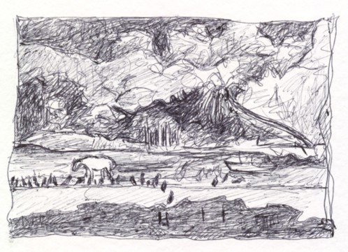
This is a scribble in ballpoint after a painting called Grande Rivière by Peter Doig. The real picture is at the National Gallery of Canada in Ottawa. Doig painted it in 2001-2002 from photographs and memory after a visit to Trinidad in 2000. The colour is quite vivid, approximating what the actual colours would be in nature but intensified and peculiar, especially the strange deep blue of the foreground water. Most striking to me are the dense background vegetation, the sickly ghostly coconut tree on the right about to keel over and die (its fronds have lost their spring and curl and are hanging straight down), and the dejected white pony at mid left surrounded by a flock of corbeaux (vultures). It’s not clear whether it’s day or night – what looks like a night sky at upper left could be more dense vegetation on a hill in the distance. To me the painting has a threatening feeling, reminding me of scenes from Conrad’s tropical short stories which usually ended tragically, with the tropical surroundings and people bringing out the main character’s fatal flaw. I’ve often felt that Conradian feeling in the Caroni swamp but not at Grande Rivière. But then I’ve only been there once.

It might be an ordinary landscape except for:

  • the size (about 7 feet by 12 feet)
  • the strange colour
  • the corbeaux, common in the area, which give the picture a spooky atmosphere, clustered as they are around the pony.

Compared to Neo Rauch’s paintings, in which everything is grossly weird and bizarre, Peter Doig’s piece is just a little off, just a little strange and disconcerting. I can’t say if I like it or not, but I find it intensely fascinating.

More about the painting and Peter Doig at the National Gallery of Canada website

Saturday, September 30, 2006

A sense of balance

As the blog goes into its second month I begin to think that drawing and writing are in different orbits and can never quite meet. Sometimes they come close but there’s a final barrier, something to do with the laws of nature, a visual/verbal divide. They can enrich each other but cannot replace or explain each other.

I like this idea. It gives me a sense of a deep natural cause or genesis for all the arts. Most likely it’s an old idea, but to me it’s new and it arises from my own experience, what I have seen and touched and otherwise felt with my senses.

Furthermore, through drawing, I’ve been able to add a sixth sense to the usual list of five, the sixth being a sense of balance. By this I don’t mean the medically well-known “position” sense, whereby when our eyes are closed we can tell which way up we are, and where our limbs are in space. Instead I mean the ability to tell when something outside ourselves is in or out of balance. I don’t know where this “sense” resides anatomically, but I can feel it best by standing well back and wiggling the lower mid-section of my body while looking intently at the thing where I’m doubtful of the balance, e.g. an object or figure in a painting – to study whether it’s in danger of toppling over.

Law-of-gravity balance is one of the first things I notice in art. That’s just the way it is. The last three posts all have balanced figures (Sabrina Charran's nude, my "Man with camera at beach", and Anna Serrao's figure), though I didn’t pick them for that reason, it just happened. And I can’t explain in words what it is about the drawings that gives the figures their balance, only that it is so. Who knows to what extent this undocumented sense of balance feeds into our intuitive response to drawings and paintings, and into the aesthetic response in general?