Sunday, December 27, 2009

Some figures

Subscribers to Drawing etc (email and RSS combined) = 60 (accurate figure), up from about 30 at the beginning of the year (a guess).

Blogs that I subscribe to = 24 (not counting the sidebar list and blogs I follow).

Total page views since Drawing etc started in August 2006 -- 30,969.

Due for a spring-clean = the OCA Bloggers list in the sidebar. Many of the photography blogs have not been updated in months.

Spring-clean already done = my studio. Hundreds of old drawings and paintings thrown out. No regrets.

Empty pages remaining in main sketchbook = 59, out of a total of 220. It's a thick hardcover 8.5 x 11" sketchbook, both sides of each page used. Photos of the filled pages are in private sets on Flickr. Not sure what this measures, perhaps how close I am to the end of my current course, though I'm less sure lately of being able to finish it at all.

Thursday, December 24, 2009

Pianist continued

I was trying to develop the pianist drawing today. I aimed to make the legs longer and develop the head and arm, but the original drawing was done in the dark and was incomplete with wrong proportions so I don't have enough information. Not sure I will take it any further, it's a digression at the moment and I'm trying to focus my energy on my current course. It was interesting to get away from course work for a while. These took about an hour each.

Acrylic and marker in A4 sketchbook

Charcoal and pastel, 11 x 14"

[Countdown: Empty pages in main sketchbook = 62]

Sunday, December 13, 2009

The solution

The event was The Marionettes Chorale Christmas show at Queen's Hall, a popular annual event, which I went to on Sunday December 6th, with pocket-size sketchbook.

The audience was in darkness while the performers on stage were well lit.

The pianist: Justin Salloum; the pannist: Johann Chuckaree. They played a lovely piece together, would it be called a duet? -- and they looked at each other often, nodding or making signs, and I thought it was a really nice and touching performance, the highlight of the show.

A Google search on "Christmas concert Trinidad" (without the quotes) brought up this link on the second page. Of the three concerts mentioned the only one with a pianist and a pannist was the Marionettes. Since I knew what I was looking for, you could cry foul!

Then I tried a search on "Christmas concert Trinidad pianist pannist" and got nothing.

Then tried again with "Christmas concert Trinidad pianist" and the Newsday link above came up first in the list!


Thanks to Duncan, Mark, Bri and Finchley land girl for taking part, and have a great Christmas everyone!


Friday, December 11, 2009

Companion drawing


This was drawn at the same time as the piano player, in the dark. It's even more fragmentary, that's why I didn't post it before. I'm pretty sure only a Trini could guess what it aims to represent. The complete solution would be the names of the two people and the event. Together with the drawn-in-the-dark clue and the time of year, there's just a chance someone might get it. If not I'll post the solution here in a few days.

Tuesday, December 8, 2009

Mystery drawing

This was drawn in the dark, literally. I wonder if anyone in Trinidad can deduce what it is, or rather, what it was supposed to be. A hint would be the time of year.

Sunday, December 6, 2009

Savannah railing at the Boissiere House

The Boissiere House from the Savannah, March 21, 2009

The Boissiere House from the Savannah, December 5, 2009

The Savannah is changing all the time. Last time I was working in this spot there was a magnificent umbrella-shaped tree with deep shade just to the east of the area in the photo (which is the Boissiere House). That tree is now gone and instead there are piles of soil and a man-made hole. Although the missing tree was behind me and doesn't affect the picture, I became disoriented and got the angle wrong.

Also, in the previous pair of photos, careful examination reveals that the nearest tree on the right is gone.

[Countdown: Empty pages in main sketchbook = 65]

Saturday, November 21, 2009

Savannah railing

Pitch Walk, April 2009

Pitch Walk, 21 November 2009

Just a few weeks ago a new railing began appearing around the Savannah. There was always a railing on the north side, but most of the rest was railing-free. Now this new railing is being installed all the way around. It's not clear what the purpose is. Gaps have been left for some of the benches, and there are other small gaps for walking through and big ones to accommodate trucks.

The photos show a section of the Pitch Walk before the railing and after. Personally I prefer it before. I sat down to paint today only to find a black bar blocking my view at eye level. It's surprisingly annoying. I wonder who decided this and why.

[Countdown: Empty pages in main sketchbook = 71]

Saturday, November 14, 2009

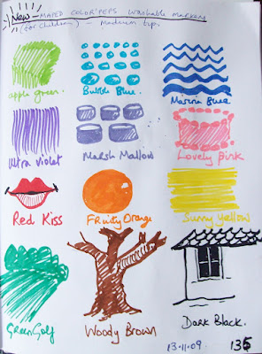
Mark-making


They had a set of children's markers in the grocery yesterday, "ultra washable". The colours looked more subtle than the usual markers so I bought a set and did a page of marks to see what they could do. Somehow the marks came out whimsical and -- silly? -- was it the markers or was it me?

17.11.09 -- photo replaced.

Sunday, October 25, 2009

Drawing with the left or non-dominant hand


Chili peppers, right hand above, left hand below.

I'd forgotten about drawing with the left (or non-dominant) hand, it's an incredibly useful thing to do. My right hand is stronger, but my left hand sees different things. The difference shows up in, say, a set of one-minute gesture drawings. My left hand will start in different places and pick out or emphasize different parts of the figure in action. I don't think it would happen as much if one was self-conscious about it, and the great thing about one-minute drawings is that they don't allow time to think. My left hand nearly always does more interesting things. It's really worth a try when one is desperate and nothing is going right.

The drawings above are ordinary drawings, not restricted to one minute. Right hand above, left hand below. Not sure they prove anything but I prefer the left-handed ones.

Thursday, October 22, 2009

Tuesday, October 20, 2009

Level best

It might sound silly but one of the things I really like in drawings and paintings is when a level surface looks level. By this I mean, for example, that because of good drawing, a drawn or painted tabletop can be seen to be level. The edges might be slanted because of perspective but we as ordinary viewers know if it's "right". This preference goes against the grain of Modernism which delighted in throwing conventional perspective out the window and which teems with "tipped up" tabletops and other such surfaces. I like these too but don't feel authentic doing it myself and besides Modernism is long gone.

I sometimes use a little test of my own to figure out if something in a drawing is level. For instance, take the chair seat in Vermeer's "Woman Reading a Letter", and try this to check if it's really level: imagine placing a marble in the centre of the seat and then feel it with your body. Will the marble stay put or will it roll off?

The thing about tipped-up tabletops in Modernism is interesting for another reason. The trend developed from a belief that Cézanne's tipped up still life paintings were a manifestation of the use of multiple viewpoints and were therefore a precursor to Cubism. In previous posts I have ventured some evidence against this view. I'm now reading a book about Cézanne's landscapes that tends to question some of the 20th century art theory that was built on the tipped-up assumptions. Very interesting indeed, more in another post.

Saturday, September 26, 2009

Marsden Hartley on painting waterfalls

I stumbled on this in a library today:

" . . . for years have had the falls at Lewiston on my mind which are wonderful and formidable indeed at times during the spring freshets, but there is always the damnable iron bridge and how to cover it up or else just go ahead and put the damn thing in for it is there, and up to now I haven't found a view that would give the fall right and yet get rid of the bridge, but the falls themselves are very wonderful and play such a part in my boyish memories."

from a letter by Marsden Hartley (1877-1943)
Bangor, Maine, January 17, 1941
quoted in A Sense of Place, by Alan Gussow

Monday, September 7, 2009

Time taken to do OCA courses


Click on table to enlarge

The table shows how long it took to do the OCA courses that I've been busy with for the last few years. The start date is when I received the course materials and the end date is when I sent the last assignment to my tutor. The time taken to select, mount and pack work for the final assessment in each course is not included, but it took about a month of intensive work for each course.

I did two courses at a time most of the way through and at one point I was doing three (June-August 2006). I can't predict yet how long the current course will take, it will be at least another six to eight months.

The whole BA Honours degree requires seven courses. It's also possible to exit with an ordinary BA after doing one level 3 course. This is where I am now. I've finished and passed Painting 3 YOE and could claim the ordinary BA, and I've seriously considered that. The main reason I've decided to continue is that I'm learning so much with the Advanced course.

Note: there were a couple of errors in the first table, these are corrected in the present version.

 P.S.: See also: Time taken to do the OCA degree 

Friday, August 28, 2009

Sketchbook with pen-holder


(Sept 5: Apologies for that last photo, it was truly awful. I've replaced it, this one is better but I don't rate myself as a photographer.)

I've tried so often to attach a pen or pencil to a sketchbook, usually with masking tape. Masking tape doesn't last for long and it leaves a sticky residue just where one holds the pencil. So I was delighted to stumble on this in the office shop. It's a simple and effective idea. The spiral binder is covered by canvas which is stitched onto the front and back covers, and the pen-holder loop is stitched into the front seam. It works for any pen which has a clip such as Micron pens (can't find one right now for the photo). Really neat and duly snapped up.

Sunday, August 23, 2009

E.O. Wilson was right


". . . mysterious and little known organisms live within walking distance of where you sit. Splendor awaits in minute proportions.
" -- Edward O. Wilson


Out of nowhere, a leaf insect on the chair, just like that.


Friday, August 21, 2009

Thumbnails 2

Click to enlarge

I've been thinking about Charles Jencks and his land forms and designs, such as this one in Scotland in the Garden of Cosmic Speculation, a wonder of the world which is open only one day in the year. Nothing to do with golf.

Wednesday, August 19, 2009

Twiddling thumbnails

Click to enlarge
It was on TV over the weekend, the PGA Championship, Thursday to Sunday as everyone knows who follows golf which I don't really except by the way. So I did a page of these little thumbnails, trying to keep a frame in mind as the cameras moved around. Actually, the thing that impresses me about golf is the perfection of the golf courses -- all that space, all that landscape, immaculately kept. A lot of muddled thoughts come piling in. I need to sort them out.

Thursday, July 30, 2009

Done with monoprints for now

Savannah landscape, water-based inks on A3 paper (approx 12 x 16")

Within the next few days I'll be sending off the first assignment of the Printmaking course I'm doing. The assignment is all about monoprinting. It includes nineteen prints selected from a large number generated during the projects. I have gone in a few weeks from knowing nothing about monoprinting to being an informed beginner. I love taking prints by hand and then carefully lifting the corners to reveal unknown surprises. I love the velcro sound made by rolling up oil-based ink.

I’ve learnt something about the history of monoprinting, and something about what contemporary printers are doing with the monoprinting medium (boy, they work big!). I’ve discovered Milton Avery’s landscapes which appeal to me very much and are a definite inspiration/influence. Unfortunately I didn’t find any of his prints but his paintings are very much to my liking.

Monoprinting seems to be very compatible with painting, it's a natural extension of the painter’s art. I’ve enjoyed this part of the course enormously and could linger on it for a longer time.

Saturday, July 11, 2009

True impressions


"A modern man registers a hundred times more sensory impressions than an eighteenth-century artist."
-- Fernand Léger, 1914.

I came across Léger's statement in Art in Theory and wondered -- is it true? (Unfortunately this is how my mind works nowadays. The first question I ask myself on reading anything is, is it true? Because if it's not true, that alters my perception of the writer as a reliable source of information and as an artist, and I often don't read further. Life is short, time is short, and for me personally untruth is a waste of precious time.)

Back to sensory impressions, then and now, and whether Léger's claim is true. He was writing in the context of the speed, machinery and new inventions of the early 20th century, so it would have been true to say that the kinds of external stimuli experienced by a modern man were different from those in the past -- noises, smells, factories instead of trees. But in quantity a hundred times more? Hardly likely. People's senses are recording impressions constantly while they're awake and there's no evidence that the anatomy or physiology of the human sensory system has changed in any way in the past two hundred years. it could even be argued that eighteenth-century man was better able to observe, register and fix his sensory impressions because of having more time and space and quietness to reflect. So that, while 18th-century man and 20th-century man experienced the same number of sensations, 18th-century man may actually have been more consciously aware of his. (I'm not claiming this as a fact by the way, it's more of a hypothesis. )

Jan Davidsz De Heem, Still-Life with Lobster and Nautilus Cup, 1634, from http://www.wga.hu/frames-e.html?/html/h/heem/jan/1/stillobs.html

Jean Baptiste-Siméon Chardin, Water Glass and Jug, c. 1760,

Supporting evidence might be found by comparing actual paintings. Sure enough, paintings by De Heem and Chardin from the 17th and 18th centuries show very much more detailed observation and sensory impressions than a typical still life by Morandi from the twentieth century. Of course De Heem and Chardin and Morandi were after very different things, but on the single question of the quantity of sensory impressions, the older guys can hold their own, thus putting Léger's assertion in doubt.

Giorgio Morandi, Still Life, 1956, from the Met

I'm suggesting that these paintings are valid choices to support the hypothesis because they're rated by the experts and are part of the unofficial canon. Other selections might show a different story.

Monday, June 29, 2009

This was the day

On the sports news today they announced that today, June 29th, was the day when the West Indies first beat England, at Lord's, back in 1950. My husband remembers exactly where he was at the moment when he heard the news. He was walking down Frederick Street in Port of Spain and it was on a ticker at W.C. Ross. That tells you what it meant to people. I've just looked up the famous match on Cricinfo, and thanks to them (what a fabulous website) we were able to reminisce over the "three W's" (Walcott, Weekes and Worrell) and get the actual batting and bowling figures. Alf Valentine took eight wickets in the first innings of the first match earlier in June.


Here he is . . . from http://www.cricinfo.com/westindies/content/player/53196.html

And an obituary in the New York Times in 2004 recalling the famous calypso by Lord Beginner inspired by the victory, "Those two little pals of mine, Ramadhin and Valentine".

Tuesday, June 16, 2009

More monoprinting

Click to enlarge

These are all oil-based ink. The one on the left is from a drawing done in 2002 (here). It's back-drawn over another monoprint from yesterday. The one in the middle is a painted monoprint from life, and the seated figure on the right is based on a painting done in 2004 (here). It nearly came out well but unfortunately the paper slipped while rubbing the back of the print. I'm discovering the endless permutations of monoprinting -- taking the first print and then a ghost because there's still some ink on the plate. Then there's the leftover ink on the side, might as well use that up, so add to the plate and go again. Dud prints can be used as the basis for later prints, or torn up and used for collage, so nothing is wasted.

Saturday, June 6, 2009

Monoprint experiments


Today I took a break from painting and had some fun experimenting with monoprinting. I used acrylic screenprinting ink which is quick and easy to use and to clean up, but harder to control on the plate than oil-based inks. The plate was a nice thick piece of glass with polished edges and I have a stack of old blank letterheads for taking trial prints. On the downside, I found that an image which looks bright and vivid on the plate may lose some of its vitality on paper. But overall it's a great way to explore the formal aspects of making art. Plus, these are very amateurish efforts, I have a ways to go to get one good print.

Amendment, Sunday June 7, 2009:

Is it "monoprint" or "monotype"? The terms are often used interchangeably but the purists prefer "monotype". Here's what Monoprints.com says:

"The two terms monotype and monoprint are often confused and need clarification. A monoprint is a print created through any technique (lithograph, etching, woodblock, etc.) that is altered after it has been printed. Each print is different from the other, as the artist works each etched or worked plate individually, adding color or wiping the ink differently each time a print is pulled. A monotype is the printing of an image from a clean, unworked surface containting no scratching, carving or drawing. The main difference is that with monotypes editions are impossible to pull.
"

The distinction between monotype and monoprint is relatively new, however, dating back only to 1978 when it was introduced by exhibition curator Jane Farmer (info from History of the Monotype by William Jung).

Saturday, May 30, 2009

Sunday, May 24, 2009

What I like about Rubens

This self portrait by Rubens draws me back again and again, for the drawing rather than the painting. In this case by "drawing" I mean the proportions and the solid sense of three-dimensional form. The bulk of the body is exactly right, as shown by the left hand in its placement and size, and the right hand, and the placement and size of these light areas against the dark robes. Together with the exact right distance from the head, these "facts" tell you all you need to know. It is masterful, it is magnificent, and I never get tired of looking at it. The bulk and the rightness give me an aesthetic buzz the way a sequence of chords gives pleasure in music. I suppose this makes me an art nerd.

This is a broad definition of drawing. Drawing is often interpreted much more narrowly, being limited to "lines" or the "shading" (a word that makes me cringe). I think of drawing as everything except the colour, but in actual fact I don't make much of a distinction between drawing and painting at all, and in things like portraits it's mostly about the drawing, whether with paint and brush or by other means.

As an aside, the expression "out of drawing" means that a drawing is off in some way, usually proportions or foreshortening, similar to what "out of tune" means in music. When a figure drawing or portrait is out of drawing, it makes the person look deformed, it may be ever so slightly, for instance the gaze of the two eyes. If you have to wonder it is probably wrong. The sad thing is that the artist is often unable to see it, such is the nature of the artist's ego.

In figurative painting the drawing shows, it can't hide. But Rubens had no need to hide his drawing, he was one of the all-time great draughtsmen. For proof, check out Daniel in the Lion's Den. All those heads and paws and hindquarters and jaws at every angle and in every variety of foreshortening imaginable -- he makes it look easy but it sure is not. I could draw a lion in the zoo for years and years and not get one paw down as well as Rubens has got eight whole lions in one painting.


He may have had an ability to see and rotate three-dimensional forms in his head the way some computer programs can create rotating 3D models. It's possible, if one has the gift plus training and practice. 

A lot of drawing is just getting things in the right place, but it is very hard and goes wrong as often as not. So celebrations are in order when it does go right.

A great Rubens website

Tuesday, May 5, 2009

Stained glass at Sacred Heart Church


Two stained glass windows seen on Sunday gone in the Sacred Heart Church on Richmond Street, Port of Spain, and below, a close-up of the plaque telling who the donor was and who the window is in memory of. They set me to thinking, about life after death and all sorts of related things, but I haven't got the thoughts sorted out yet and if I did probably wouldn't say, so the pictures are just for the record.

Monday, April 27, 2009

Art in Theory 2

A couple more snippets from Art in Theory.

August Endell (1871-1925) gets the nod because he turned out to be right:

"For they can clearly see, that we are not only at the beginning of a new stylistic phase, but at the same time on the threshold of the development of a completely new Art. An Art with forms which signify nothing, represent nothing, and remind us of nothing, which arouse our souls as deeply and strongly as music has always been able to do." (published in 1898)

-- page 59

August Macke (1887-1914), idealism showing through:

"The joys, the sorrows of man, of nations, lie behind the inscriptions, paintings, temples, cathedrals, and masks, behind the musical compositions, stage spectacles, and dances. If they are not there. if form becomes empty and groundless, then there is no art." (published in 1912)

-- page 95

Friday, April 24, 2009

Art in Theory 1


Just got this from Amazon a couple of days ago and I'm pleasantly surprised. I read a book by Harrison and Wood from the library some years ago and my personal verdict was "No." So it took a long time to get around to buying this, and the scale was finally tipped by a recommendation from an OCA friend. I looked at it in dismay, paged through the Contents (18 pages) and wondered how to tackle it. Dip in here and there? Or begin at the beginning? I could never read it all, but eventually I decided to begin at the beginning with a flexible approach, skipping without guilt anything that's too boring or tedious or incomprehensible.

The book, 1248 pages, consists of extracts of texts on art theory. It's similar to and complements Theories and Documents of Contemporary Art (1945 to the mid 1990s) but it covers a broader time frame (1900 to 2000). I'm pleasantly surprised because there are so many painters here and lots of interesting stuff that I haven't seen before. There are many theorists and philosophers as well of course, especially later in the century. As I plod through it, I'll post the odd quote here and there.

This one comes from an essay by Maurice Denis published in 1909:

"We affirm that the emotions or states of the soul provoked by some spectacle, create in the artistic imagination signs or plastic equivalents capable of reproducing these emotions or states of the soul without the need to create a copy of the initial spectacle; that each state of our sensibility must correspond to an objective harmony capable of being thus translated."

-- page 48.

Friday, April 17, 2009

News of the day


President Obama arrived half an hour early this afternoon along with several other world leaders for the Summit of the Americas here in Port of Spain.

The blurred photo isn't the fault of the camera, it's because I had it on the wrong setting and everything was happening so fast.

Sunday, April 12, 2009

How Rembrandt drew Jan Six's bridge

Rembrandt, Six's Bridge, 1645, etching, 12.9 cm x 22.4 cm 
(about 5 x 8"), Rijksmuseum

This is one of my favourite Rembrandt drawings, who knows why? While looking it up today I stumbled on this account of how it came to be made:

"The love of his art caused him to be always provided with the materials for drawing and etching, so that we have these transcripts of nature fresh from the fountain head. We know this from an anecdote mentioned by Daulby. In describing the etching of "Six's Bridge," in his catalogue, he says, "This plate was produced by an incident which deserves to be related. Rembrandt lived in great intimacy with the Burgomaster Six, and was frequently at his country seat. One day, when they were there together, the servant came to acquaint them that dinner was ready, but as they were sitting down to table, they perceived that mustard was wanting. The Burgomaster immediately ordered his servant to go into the village to buy some. Rembrandt, who knew the sluggishness of the Dutch servants, and when they answer austons (a-coming) they are half an hour before they appear, offered the Burgomaster a wager that he would etch a plate before his man returned with the mustard. Six accepted the wager, and Rembrandt, who had always plates at hand ready varnished, immediately took one up, and etched upon it the landscape which appeared from the window of the parlour in which they were sitting. The plate was finished before the servant returned, and Rembrandt won his wager. The etching is slight, but it is a wonderful performance, considering the circumstance that produced it." It is not wonderful on account of the rapidity with which it was done, but the genius and science that pervade every touch, not only in the general arrangement, but in the judicious management of the smallest darks; they are all in the most effective situations. When the plate was bit in, the name was left out; it was afterwards added with the dry point; also a little shading was given to the hat of one of the figures on the bridge, which in the rare state is white."

From Rembrandt and His Works by John Burnet FRS, London, MDCCCXLIX. (1849?) -- but really from the Project Gutenberg ebook of the above book, http://www.gutenberg.org/files/22690/22690-h/22690-h.htm

And to think, it was 200 years before Impressionism.


Monday, April 6, 2009

Recycling cardboard


Small pieces of cardboard can be used to paint on and I rescue them whenever I can. I've primed these with a thin coat of glue (white glue mixed 1:1 with water) and now they can be used for any medium including oils since the priming seals the surface and prevents paint from being absorbed into the cardboard. The glue looks whitish and semi-opaque when wet but is transparent when dry. The one on the left is bowing with the wet glue but the card is thin and pliable and can be mounted on something else if the work is worth keeping. If preferred the priming can be done with acrylic gesso instead which gives an opaque white ground.

I like having a few of these around ready-primed. Being cheap, not to mention virtually free, one doesn't feel inhibited or afraid of wasting materials when using them. These are ordinary grey cardboard. The brown corrugated cardboard can be used too but it isn't quite as good.

Saturday, March 28, 2009

Set-up for exposing the screen positive


I just found this picture in iPhoto. I've posted a similar picture before, but this one explains better what actually happens when exposing a film positive and making a stencil on to light sensitive emulsion.

When doing the screenprints for the landscape series I did everything myself, naturally (who else would do it?) and made many mistakes -- but was startled and brought down to earth by my tutor, who said that in his day they had technicians to do this sort of thing. This was deflationary, for sure, but it seems worthwhile to me to have a total grasp of the process through doing it myself.

The photo shows how the lamp is rigged up at a specific height above the screen -- books can be added or taken away under the board as necessary to get the exact distance, it's a very flexible set-up. Also worth noting, there's a sheet of black paper under the screen frame to minimize reflected light, and a black cloth along the back to block light coming in under the door.

The screen is placed on the black paper, fabric side up; the film positive is placed on top of the fabric, and a sheet of glass is placed on top of that to ensure good contact; and then the light is turned on for six minutes. You can just about see the green light-sensitive emulsion on the yellow screen fabric. For the larger version of the tree I got a film positive made from my jpeg at Print on Demand on Tragarete Road.

Thursday, March 26, 2009

That series

This is it, on Picasa, all six pictures. Click one to see at a bigger size.

Or (some html, not sure what it will do . . . )

Home Thoughts From Abroad

Tuesday, February 24, 2009

Oil or acrylic?

Guitar Player, acrylic on canvas, about 8" x 8"

Which is better, oil or acrylic? Why use one rather than the other?

For a while now I've been using mostly acrylic. It's better suited for the kinds of things I've needed to do for OCA courses, and it's definitely better for packing up and sending off to a tutor. It dries quickly and can be overpainted far more easily than oil. Acrylic gear is lighter than oil to carry outdoors. It's less messy to clean up than oil, needing only soap and water. It's almost essential for many contemporary techniques such as layering and dripping and a lot of mixed media work.

But it has big disadvantages too. The main one is that the paint shrinks as it dries, losing up to a third of its volume. This means that a passage that looked well-covered while being painted can end up looking thin and streaky after the paint is dry. Acrylic also gets more transparent or darker as it dries because the binder is a glue which is white and opaque while wet, but which dries clear. These two together, the shrinking and the darkening, mean that what you see is not what you get.

Guitar Player, oil on canvas, approx 7" x 7"

Oil on the other hand is far harder to work with than acrylic. Any given piece is more likely to be a total failure, and it's messy while working and to clean up. But to give oil its due, if you leave a brush overnight loaded with paint, little harm will come to it (though it's not a good idea). A major plus is that the colours are the same when dry as when wet, the only medium where this is so. Despite all its difficulties I prefer working with oil and get more of a feeling of achievement if a piece comes out well.

But the bottom line is that both have their pros and cons, and personally I wouldn't want to be without either. Now that I'm venturing into printmaking the same issues are beginning to crop up. Oil-based inks or water-based? Some things never change.

Friday, February 13, 2009

The twisted tube comes to a sticky end

This is what happened when I went to open that tube of white oil paint mentioned in an earlier post (Twisted tube) -- the head and top of the tube came clean off. It just came away in my hand with no effort or force at all. On the bright side, it's easier to get paint out of the tube now, and I've wrapped it in plastic film to prevent the paint from drying out.

Sunday, February 8, 2009

Before and after

Big studio clean-up this past week. Here are the promised before-and-after pictures:

Can't think of anything else to say!

Thursday, February 5, 2009

Beginnings No. 1 final stage


. . . except the series isn't called "Beginnings" any more, it's not even "Remembered Landscapes". This is the final version of the first piece with the tree screenprinted on. I guess there's some explaining to do, and I'll do it in a few days. In the meantime I'm still recovering, and the last few days I've been doing a massive studio clean-up. Before and after photos coming soon!

Related posts:
Series overview
Beginnings 1 stage 4
Stage 3
Stage 2
Stage 1
Choosing a theme

Thursday, January 15, 2009

Vote for top artists of 20th century

Vote here for your top artists of the 20th century at the Saatchi Gallery website

I voted for these. [In brackets, their ranking and the number of votes after I was done.]

Pablo Picasso [1; 121795]
Paul Klee [19; 111912]
Anselm Kiefer [63; 82626]
Alice Neel [147; 78573]
Andy Warhol [9; 112772]
Auguste Renoir [51; 83819]
David Hockney [81; 81950]
Agnes Martin [185; 60769]
Sean Scully [388; 49555]
Joseph Beuys [32; 107115]

Evidently it's a Phaidon list and not everyone who is anyone is on it.

Vote here for your top artists of the 20th century


Sunday, January 11, 2009

Finding the best exposure time


Light-sensitive emulsion, also known as photo-emulsion, is wonderful for making certain kinds of stencils in screenprinting. In particular, it's useful for reproducing detailed ink drawings with fine delicate lines which would be difficult to do any other way. On the down side, timing the exposure correctly is tricky. If the time is too short the image will wash out too much. If it's too long, the image may take forever to wash out and parts may not wash out at all. So, getting the timing right is of the essence.

There's no hard and fast rule because every set-up is slightly different. The one good rule is to do a series of timed exposures to establish the best time for one's specific set of variables.

My variables are: A 150-watt flood lamp; distance from lamp to screen, 17 inches; diazo photo emulsion on the fabric side only (underside). After doing a series of test exposures (2, 4, 6, 8, 10 and 12 minutes) the optimum time turned out to be 5 minutes. This is an amazingly useful thing to know. I had been using much longer times and was having a terrible job washing the emulsion out.

Tuesday, January 6, 2009

Two kinds of sketchbooks


Looking through my sketchbook for something to post, I found this pencil drawing of Joseph Beuys's coyote from I like America, America Likes Me (video), done many months ago, approx A4.

These days my sketchbooks look more like the one below, a combination sketchbook/journal/logbook. with things stuck in at will and still evolving.